
import { Table } from "@vitality-ds/components";
Tables are perfect for displaying lots of data in a user interface. Well-designed tables are clearly organised with logical presentation and structure. Always use meaningful column labels and cell types to help the reader understand what is being presented.
() => {
  const columns = [
    { colId: "patientName", label: "Patient Name" },
    { colId: "age", label: "Age" },
    { colId: "dob", label: "Date of Birth" },
  ];

  const rows = [
    {
      id: "1",
      patientName: "Owens, Vera",
      age: "32",
      dob: "21/10/1989",
    },
    {
      id: "2",
      patientName: "Hooper, Diedre",
      age: "42",
    },
  ];

  return <Table columns={columns} tableData={rows} />;
};
Table supports 8 types of cells:
Each of these cells determines how the data is displayed in the table. Some cell types require additional configuration because they are more complex - like a link which has text and a href, whereas more primitive data like a text or number cell don't require additional configuration.
You can configure a table's columns by passing an array of objects describing their data types. Each column needs a colId (the id of the column) and label (the text displayed in the header row). All columns will default to text cells, but the type of cell can be set with cellType.
const columns = [
  { colId: "patientName", label: "Patient Name", cellType: "text" },
  { colId: "invoiceTotal", label: "Invoice Total", cellType: "number" },
];
For certain column data types, you may which to specify how to render / configure the contents of a cell. For example, displaying the critical colour on negative number values. To do this, pass a function to getCellProps. This function accepts the column's id (colId) as well as the entire row's data (rowData). This allows you to compute values or pass value-dependent props to the cell. You can also configure props for all the cells in the column using the same function.
() => {
  const columns = [
    {
      colId: "patientName",
      label: "Patient Name",
      getCellProps: (colId, rowData) => ({
        children: rowData[colId],
        textAlign: "center",
      }),
    },
    {
      colId: "invoiceBalance",
      cellType: "number",
      label: "Invoice Balance",
      getCellProps: (colId, rowData) => {
        const commonProps = {
          children: rowData[colId],
        };

        if (rowData[colId] < 0) {
          return {
            ...commonProps,
            color: "critical",
          };
        }

        return commonProps;
      },
    },
  ];

  const rows = [
    {
      id: "1",
      patientName: "Owens, Vera",
      invoiceBalance: 123,
    },
    {
      id: "2",
      patientName: "Hooper, Diedre",
      invoiceBalance: -456,
    },
  ];

  return <Table columns={columns} tableData={rows} />;
};
Below outlines a full list of available props to configure for each cell type with the getCellProps function, and links to that component's documentation for further reading.
Text columns are the most commonly used type within tables. The data displayed is typically plain text. If no cellType prop is passed, it will default to a text cell.
All valid
Typographyprops can be passed to the cell, except forvariantandhtmlTag, which are preconfigured for use within a table cell. Currently the table configuration also doesn't allow the passing of child JSX elements, so text cells do not support things like<strong>strong text</strong>.
() => {
  const columns = [
    {
      colId: "patientName",
      cellType: "text",
      label: "Patient Name",
      getCellProps: (colId, rowData) => {
        const namesArr = rowData[colId].split(",");
        const reorder = [1, 0];
        const readableName = reorder.map((i) => namesArr[i]).join(" ");
        return {
          children: readableName,
        };
      },
    },
    {
      colId: "invoiceBalance",
      cellType: "number",
      label: "Invoice Balance",
    },
  ];

  const rows = [
    {
      id: "1",
      patientName: "Owens, Vera",
      invoiceBalance: 123,
    },
    {
      id: "2",
      patientName: "Hooper, Diedre",
      invoiceBalance: -456,
    },
  ];
  return <Table columns={columns} tableData={rows} />;
};
Number cells are the same as text cells in the handling of 'raw' data, however they align to the right hand side of the cell to improve readability. Below shows a simple example where each number column type will determine how to render each of its cells based on value. In this example, we use the critical color if the value is a negative number.
All valid
Typographyprops can be passed to the cell, except fortextAlign,variantandhtmlTag, which are preconfigured for use within a table cell.
() => {
  const columns = [
    { colId: "patientName", cellType: "text", label: "Patient Name" },
    {
      colId: "invoiceBalance",
      cellType: "number",
      label: "Invoice Balance",
      getCellProps: (colId, rowData) => {
        const commonProps = {
          children: rowData[colId],
        };

        if (rowData[colId] < 0) {
          return {
            ...commonProps,
            color: "critical",
          };
        }

        return commonProps;
      },
    },
  ];

  const rows = [
    {
      id: "1",
      patientName: "Owens, Vera",
      invoiceBalance: 123,
    },
    {
      id: "2",
      patientName: "Hooper, Diedre",
      invoiceBalance: -456,
    },
    {
      id: "3",
      patientName: "Smith, John",
      invoiceBalance: 0,
    },
    {
      id: "4",
      patientName: "Fox, Holly",
      invoiceBalance: -108,
    },
  ];
  return <Table columns={columns} tableData={rows} />;
};
Status badges are useful to communicate the status of an action or entity. Common use cases include success, warning and critical errors. It should easily communicate actions that have or need to be taken. Below shows a simple example where each StatusBadge column will determine how to render each of its cells based on value.
All valid
StatusBadgeprops can be passed to the cell.
() => {
  const columns = [
    { colId: "patientName", cellType: "text", label: "Patient Name" },
    {
      colId: "appointmentStatus",
      cellType: "statusBadge",
      label: "Appointment Status",
      getCellProps: (colId, rowData) => {
        if (rowData[colId] === "cancelled") {
          return {
            icon: <Error />,
            label: "Cancelled",
            severity: "critical",
          };
        }
        return {
          icon: <Completed />,
          label: "Confirmed",
          severity: "success",
        };
      },
    },
  ];

  const rows = [
    {
      id: "1",
      patientName: "Owens, Vera",
      appointmentStatus: "confirmed",
    },
    {
      id: "2",
      patientName: "Hooper, Diedre",
      appointmentStatus: "cancelled",
    },
  ];
  return <Table columns={columns} tableData={rows} />;
};
Icons offer a visual representation of a command, device, directory or common action and should be used to provide clarity. Below shows a simple example where you can determine which icon to display based on the cell's value.
All valid
Iconprops can be passed to the cell.
() => {
  const columns = [
    { colId: "patientName", label: "Patient Name" },
    {
      colId: "documentType",
      cellType: "icon",
      label: "Document Type",
      getCellProps: (colId, rowData) => {
        if (rowData[colId] === "consult_note") {
          return {
            icon: <ConsultNote />,
            title: "Consult Note",
          };
        }
        return {
          icon: <DiagnosticReport />,
          title: "Diagnostic Report",
          color: "critical",
        };
      },
    },
  ];

  const rows = [
    {
      id: "1",
      patientName: "Owens, Vera",
      documentType: "consult_note",
    },
    {
      id: "2",
      patientName: "Hooper, Diedre",
      documentType: "diagnostic_report",
    },
  ];

  return <Table columns={columns} tableData={rows} />;
};
Icon buttons are clickable icons that perform an action. They are useful when the action should not be visually prominent. In tables, an IconButton cell type can be useful when you have special actions to perform that are not standard "row actions". Examples may include launching a modal or adding a consult note.
Below shows a simple example where you can determine which IconButton to display based on the cell's value. In this example, we only display the component if the number of consult notes is 0 – indicating that a user may wish to add a note via this IconButton. Note that the Vitality IconButton component has a default 'Add' icon which will display if no icon is assigned.
All valid
IconButtonprops can be passed to the cell, except forsize, which is preconfigured for use within a table cell.
() => {
  const columns = [
    { colId: "patientId", label: "Patient Id", type: "number" },
    { colId: "patientName", label: "Patient Name" },
    { colId: "numConsultNotes", label: "# Consult Notes", cellType: "number" },
    {
      colId: "addNoteColumn",
      cellType: "iconButton",
      label: "Add Note",
      getCellProps: (colId, rowData) => {
        if (!rowData.numConsultNotes) {
          return {
            icon: <ClinicalItemNote />,
            onClick: () =>
              console.log(`Add note for user ${rowData.patientId}`),
            tooltipContent: `Add note for user ${rowData.patientId}`,
          };
        }
      },
    },
  ];

  const rows = [
    {
      id: "1",
      patientId: "0004",
      patientName: "Owens, Vera",
      numConsultNotes: 4,
    },
    {
      id: "2",
      patientId: "0009",
      patientName: "Hooper, Diedre",
      numConsultNotes: 0,
    },
  ];

  return <Table columns={columns} tableData={rows} />;
};
Links provide a hyperlink that navigates the user to another page. Navigating the user to another page is a common Row Action, but in some cases where the link is not the main action to be triggered on row click, you can use this.
In the example below, you can see the getCellProps function provide the dynamic href property based on each cell type while enforcing that all links have the same text.
All valid
Linkprops can be passed to the cell.
() => {
  const columns = [
    { colId: "patientName", label: "Patient Name" },
    { colId: "age", label: "Age" },
    {
      colId: "link",
      label: "Link",
      cellType: "link",
      getCellProps: (colId, rowData) => ({
        href: `/patients/clinical/${rowData.id}`,
        children: "Go to Clinical File",
      }),
    },
  ];

  const rows = [
    {
      id: "1",
      patientName: "Owens, Vera",
      age: "32",
    },
    {
      id: "2",
      patientName: "Hooper, Diedre",
      age: "42",
    },
  ];

  return <Table columns={columns} tableData={rows} />;
};
Buttons are visually prominent calls to perform an action. Below shows a simple example where you can determine which Button to display based on the cell's value. In this example, we only display the component if the number of consult notes is 0 – indicating that a user may wish to add a note via this button.
All valid
Buttonprops can be passed to the cell, except forsize, which is preconfigured for use within a table cell.
() => {
  const columns = [
    { colId: "patientId", label: "Patient Id", type: "number" },
    { colId: "patientName", label: "Patient Name" },
    { colId: "numConsultNotes", label: "# Consult Notes", cellType: "number" },
    {
      colId: "addNoteColumn",
      cellType: "button",
      label: "",
      getCellProps: (colId, rowData) => {
        if (!rowData.numConsultNotes) {
          return {
            children: "Add Note...",
            onClick: () => alert(`Add note for user ${rowData.patientId}`),
          };
        }
      },
    },
  ];

  const rows = [
    {
      id: "1",
      patientId: "0004",
      patientName: "Owens, Vera",
      numConsultNotes: 4,
    },
    {
      id: "2",
      patientId: "0009",
      patientName: "Hooper, Diedre",
      numConsultNotes: 0,
    },
  ];

  return <Table columns={columns} tableData={rows} />;
};
Row Actions include icon buttons that perform an action on the specific row of data they belong to. There are four possible actions: edit, delete, print and download. On @bp2 and above, row actions are hidden until the user hovers over the row.
Configuration of row actions is a little different because this cell can contain multiple icon buttons. All valid icon button props should be assigned to the action they belong to, demonstrated in the example below.
All valid
IconButtonprops can be passed to the action (edit, delete, download or print), except forsize, which is preconfigured for use within a table cell.
() => {
  const permissionData = {
    doctor: ["download", "print", "edit"],
    administrator: ["delete", "download", "print", "edit"],
    receptionist: ["edit"],
  };

  const [role, setRole] = React.useState("receptionist");
  const tableData = [
    {
      id: "1",
      patientName: "Hamm, John",
    },
    {
      id: "2",
      patientName: "Fox, Holly",
    },
  ];

  const getActionPropsForItem = (colId, rowData) => {
    const { rowActions = [] } = rowData;
    return {
      ...(permissionData[role].includes("download") && {
        download: {
          onClick: () => alert(`Downloading record for ${rowData.patientName}`),
        },
      }),
      ...(permissionData[role].includes("print") && {
        print: {
          onClick: () => alert(`Printing record for ${rowData.patientName}`),
        },
      }),
      ...(permissionData[role].includes("edit") && {
        edit: {
          onClick: () => alert(`Editing record for ${rowData.patientName}`),
        },
      }),
      ...(permissionData[role].includes("delete") && {
        delete: {
          onClick: () => alert(`Deleting record for ${rowData.patientName}`),
        },
      }),
    };
  };

  const columns = [
    {
      colId: "patientName",
      label: "Patient Name",
    },
    {
      colId: "rowActions",
      label: "Actions",
      cellType: "rowActions",
      getCellProps: getActionPropsForItem,
    },
  ];

  const radioButtonConfig = {
    value: role,
    type: "radioButtons",
    label: "Role",
    id: "contactMethod",
    onChange: (newValue) => setRole(newValue),
    inputProps: {
      name: "contactMethod",
      direction: "horizontal",
      options: [
        {
          label: "Administrator",
          value: "administrator",
          id: "administrator",
        },
        {
          label: "Doctor",
          value: "doctor",
          id: "doctor",
        },
        {
          label: "Receptionist",
          value: "receptionist",
          id: "receptionist",
        },
      ],
    },
  };

  return (
    <DocsBox css={{ width: "100%" }}>
      <Stack>
        <FormField {...radioButtonConfig} />
        <Table tableData={tableData} columns={columns} />
      </Stack>
    </DocsBox>
  );
};
Switches allow you to toggle a value immediately. Below shows a simple example where you can toggle the true/false value that relates to the column. When using a Switch column type, the column header should include a short phrase that describes the attribute being set to on/off. For example, Approved or Recieve notifications. The use of a question mark is deemed generally unnecessary, so aim to omit this unless absolutely crucial to help the user.
All valid
Switchprops can be passed to the cell.
() => {
  const [checkedRows, setCheckedRows] = React.useState({ 1: true });
  const columns = [
    { colId: "patientId", label: "Patient Id", type: "number" },
    { colId: "patientName", label: "Patient Name" },
    {
      colId: "approved",
      label: "Approved",
      cellType: "switch",
      getCellProps: (colId, rowData) => ({
        checked: rowData[colId],
        id: colId,
        onCheckedChange: () =>
          setCheckedRows({
            ...checkedRows,
            [rowData.id]: !checkedRows[rowData.id],
          }),
      }),
    },
  ];

  const rows = [
    {
      id: "1",
      patientId: "0004",
      patientName: "Owens, Vera",
      approved: checkedRows["1"],
    },
    {
      id: "2",
      patientId: "0009",
      patientName: "Hooper, Diedre",
      approved: checkedRows["2"],
    },
  ];

  return <Table columns={columns} tableData={rows} />;
};
For data that may be incomplete or needs to be edited in bulk, assign the column cell type to the input type and handle state through the getCellProps function. Valid cellTypes include textInput, select, asyncSelect, creatableSelect, currencyInput, datePicker, durationInput, searchInput, searchSelectInput, timePicker. See all cell props for a complete list of props and links to the individual child component's documentation.
() => {
  const [formData, setFormData] = React.useState([
    {
      id: "1",
      patientName: "Louise Bercher",
      practitioner: "",
      appointment: "2024/04/21",
      duration: "30",
      appointmentType: "",
    },
    {
      id: "2",
      patientName: "",
      practitioner: "",
      appointment: "",
      duration: "15",
      appointmentType: "",
    },
    {
      id: "3",
      patientName: "",
      practitioner: "",
      appointment: "",
      duration: "0",
      appointmentType: "",
    },
  ]);

  const nameChangeHandler = (newValue, id, colId) => {
    const newFormDataValue = formData.map((row) => {
      if (row.id === id) {
        return { ...row, [colId]: newValue };
      }
      return row;
    });
    setFormData(newFormDataValue);
  };

  const fetchProviders = (inputValue) => {
    const patientNames = [
      { label: "Priya Singh", value: "priyaSingh" },
      { label: "Andrew Demo", value: "andrewDemo" },
      { label: "Lisa Smith", value: "lisaSmith" },
    ];
    return patientNames.filter((name) =>
      name.label.toLowerCase().includes(inputValue.toLowerCase())
    );
  };

  async function findProvider(inputValue) {
    const result = await fetchProviders(inputValue);
    return result;
  }

  const columns = [
    {
      colId: "patientName",
      cellType: "textInput",
      label: "Patient Name",
      getCellProps: (colId, rowData) => ({
        onChange: ({ target: { value } }) =>
          nameChangeHandler(value, rowData.id, colId),
        value: formData.find(({ id }) => id === rowData.id)?.patientName,
        name: "patientName",
      }),
    },
    {
      colId: "practitioner",
      cellType: "searchSelectInput",
      label: "Practitioner",
      getCellProps: (colId, rowData) => ({
        onSearch: (inputValue) => findProvider(inputValue),
        onChange: (newValue) => nameChangeHandler(newValue, rowData.id, colId),
        name: "practitioner",
        id: "practitioner",
        value: formData.find(({ id }) => id === rowData.id)?.practitioner,
        portalMenu: true,
      }),
    },
    {
      colId: "nextAppointment",
      cellType: "datePicker",
      label: "Appointment",
      getCellProps: (colId, rowData) => ({
        onChange: (newValue) =>
          nameChangeHandler(newValue.value, rowData.id, colId),
        name: "appointment",
        id: "appointment",
        value: formData.find(({ id }) => id === rowData.id)?.appointment,
      }),
    },
    {
      colId: "duration",
      cellType: "timePicker",
      label: "Duration",
      getCellProps: (colId, rowData) => ({
        onChange: (newValue) =>
          nameChangeHandler(newValue.value, rowData.id, colId),
        name: "duration",
        id: "duration",
        value: formData.find(({ id }) => id === rowData.id)?.duration,
        portalMenu: true,
      }),
    },
    {
      colId: "appointmentType",
      cellType: "select",
      label: "Appt Type",
      getCellProps: (colId, rowData) => ({
        onChange: (newValue) => nameChangeHandler(newValue, rowData.id, colId),
        name: "appointment-type",
        id: "appointment-type",
        value: formData.find(({ id }) => id === rowData.id)?.appointmentType,
        options: [
          { label: "New patient", value: "newPatient" },
          { label: "Antenatal", value: "antenatal" },
          { label: "Follow up", value: "followUp" },
        ],
        portalMenu: true,
      }),
    },
  ];

  const rows = [
    {
      id: "1",
    },
    {
      id: "2",
    },
    {
      id: "3",
    },
  ];

  return <Table tableData={rows} columns={columns} />;
};
The custom cell type accepts any JSX components, allowing you to customise the column with any components that you need. Below shows a simple example where you can display a patient's initials using a custom component. When using the custom column type, the component prop will need to be returned in the getCellProps function.
() => {
  const CustomComponent = (props) => <Avatar {...props} />;

  return (
    <Table
      id={"default"}
      columns={[
        { colId: "patientId", label: "Patient Id", cellType: "number" },
        { colId: "patientName", label: "Patient Name" },
        {
          colId: "initials",
          label: "Initials",
          cellType: "custom",
          getCellProps: (colId, rowData) => {
            const patientName =
              rowData["patientName"].split(", ")[0][0] +
              rowData["patientName"].split(", ")[1][0];

            return {
              component: <CustomComponent initials={patientName} size={"sm"} />,
            };
          },
        },
      ]}
      tableData={[
        {
          id: "1",
          patientId: "0004",
          patientName: "Owens, Vera",
        },
        {
          id: "2",
          patientId: "0009",
          patientName: "Hooper, Diedre",
        },
      ]}
    />
  );
};
Table data contains all the data to fill the table's cells. In most cases, this may be a JSON response from a server. Each row object must have its own unique id string. Most data sources should have unique IDs (for example, using the patient's id for a table of patients), or for cases where no such value is present, you can determine a unique id by generating one.
const tableData = [
  // all keys must be the same as the colId they map to
  {
    // Row 1
    id: "1",
    patientName: "Owens, Vera",
    age: "32",
    dob: "21/9/1989",
  },
  // Row 2
  {
    id: "2",
    patientName: "Hooper, Diedre",
    age: "42",
  },
];
The onRowClick prop enables the execution of a function when a row is clicked. It utilises two parameters from the row: the first is rowData which returns the row data in the form of an object, and the second is event which returns the relevant event data such as the HTML target.
(rowData, event) => myFunction(rowData, event).
() => {
  const [value, setValue] = React.useState({});

  function handleOnClick(rowData, event) {
    setValue(rowData);
    if (event.target.style.color === "var(--vitality-colors-critical9)") {
      event.target.style.color = "var(--vitality-colors-neutral12)";
    } else {
      event.target.style.color = "var(--vitality-colors-critical9)";
    }
  }

  const columns = [
    {
      colId: "name",
      label: "Name",
      cellType: "text",
    },
    {
      colId: "dob",
      label: "Date of Birth",
      cellType: "text",
    },
    {
      colId: "billingStatus",
      label: "Billing Status",
      cellType: "statusBadge",
      getCellProps: (colId, rowData) => {
        if (rowData[colId]) {
          const statusLabel = rowData[colId].split("_");
          if (statusLabel.length === 3) {
            return {
              severity: "success",
              label: `${statusLabel[0]} ${statusLabel[1]} ${statusLabel[2]}`,
            };
          }
          return {
            severity: "critical",
            label: `${statusLabel[0]} `,
          };
        }
      },
    },
  ];

  const tableData = [
    {
      id: "1",
      name: "McLeod, Sam",
      dob: "12/12/2000",
      billingStatus: "up_to_date",
    },
    {
      id: "2",
      name: "Owens, Vera",
      dob: null,
      billingStatus: "overdue",
    },
    {
      id: "3",
      name: "Mays, Thomas",
      billingStatus: null,
    },
    {
      id: "4",
      name: "Hooper, Diedre",
      dob: "02/02/1958",
      billingStatus: "overdue",
    },
  ];

  return (
    <Stack spacing="md">
      <Table
        columns={columns}
        tableData={tableData}
        onRowClick={(rowData, event) => handleOnClick(rowData, event)}
      />
      <p>Name: {value.name}</p>
      <p>Date of Birth: {value.dob}</p>
      <p>Billing Status: {value.billingStatus}</p>
    </Stack>
  );
};
When a row has an onRowClick function and is clicked, it has an active state. Should you require a row to default to active on first render, assign that row's id to the prop defaultActiveRow. Note this prop does not actually call the function on render, it simply styles the row as if it were clicked. This is useful if your onRowClick function is used to display data in another component, for example a preview panel that displays the first table item on render.
() => {
  const [activeRow, setActiveRow] = React.useState({
    name: "Owens, Vera",
    dob: null,
    billingStatus: "overdue",
    id: "2",
  });

  const columns = [
    {
      colId: "name",
      label: "Name",
      cellType: "text",
    },
    {
      colId: "dob",
      label: "Date of Birth",
      cellType: "text",
    },
    {
      colId: "billingStatus",
      label: "Billing Status",
      cellType: "statusBadge",
      getCellProps: (colId, rowData) => {
        if (rowData[colId]) {
          const statusLabel = rowData[colId].split("_");
          if (statusLabel.length === 3) {
            return {
              severity: "success",
              label: `${statusLabel[0]} ${statusLabel[1]} ${statusLabel[2]}`,
            };
          }
          return {
            severity: "critical",
            label: `${statusLabel[0]} `,
          };
        }
      },
    },
  ];

  const tableData = [
    {
      id: "1",
      name: "McLeod, Sam",
      dob: "12/12/2000",
      billingStatus: "up_to_date",
    },
    {
      id: "2",
      name: "Owens, Vera",
      dob: null,
      billingStatus: "overdue",
    },
    {
      id: "3",
      name: "Mays, Thomas",
      billingStatus: null,
    },
    {
      id: "4",
      name: "Hooper, Diedre",
      dob: "02/02/1958",
      billingStatus: "overdue",
    },
  ];

  const RowDataPreview = ({ name, dob, billingStatus }) => (
    <DocsBox
      css={{
        background: "$neutral1",
        borderRadius: "$md",
        padding: "$md",
        height: "100%",
        width: "100%",
        display: "flex",
        flexDirection: "column",
        justifyContent: "center",
        alignItems: "center",
      }}
    >
      <Typography>{name || "Name unknown"}</Typography>
      <Typography>{dob || "DOB unknown"}</Typography>
      <Typography>{billingStatus || "Billing status unknown"}</Typography>
    </DocsBox>
  );

  return (
    <div
      style={{
        display: "grid",
        gridTemplateColumns: "1fr 1fr",
      }}
    >
      <Table
        columns={columns}
        tableData={tableData}
        onRowClick={(rowData) => setActiveRow(rowData)}
        defaultActiveRow={activeRow.id}
      />
      <RowDataPreview
        name={activeRow.name}
        dob={activeRow.dob}
        billingStatus={activeRow.billingStatus}
      />
    </div>
  );
};
Row selection in Vitality enables batch actions to be performed on selected rows. To activate row selection, add selectableRows={true} to the table element a selection column will be applied to each row. This additional row should be taken into consideration for the gridTemplateColumns.
To make the selection feature work,
id's must be added to your row data. This id must be unique in each row.
To retrieve the selected data, you can pass a function to the onSelectChange prop, which has two parameters: actions and state. actions contains the trigger of the last selection change and includes the id of the affected elements. For instance, if you use the toggle all feature, the type of the action is ADD_ALL, and the payload contains all the ids as all rows were selected. state contains an array of all currently selected id's.
() => {
  const columns = [
    { colId: "patientName", label: "Patient Name" },
    { colId: "age", label: "Age" },
    { colId: "dob", label: "Date of Birth" },
  ];

  const rows = [
    {
      id: "1",
      patientName: "Owens, Vera",
      age: "32",
      dob: "21/9/1989",
    },
    {
      id: "2",
      patientName: "Hooper, Diedre",
      age: "42",
    },
  ];

  const [selection, setSelection] = React.useState([]);

  return (
    <Stack>
      <Table
        onSelectChange={(action, state) => {
          setSelection(state.ids);
        }}
        selectableRows={true}
        gridTemplateColumns="35px 1fr 1fr 1fr"
        columns={columns}
        tableData={rows}
      />
      <Typography>Selected id's: {selection.join(", ")}</Typography>
    </Stack>
  );
};
Selectable table rows can have one or more items checked on first render by passing an array of the row ids to defaultSelectedRows. A use case for this prop might include pre-selecting items based on a condition that enables a user to quickly perform a common batch action.
() => {
  const columns = [
    {
      colId: "name",
      label: "Name",
      cellType: "text",
    },
    {
      colId: "dob",
      label: "Date of Birth",
      cellType: "text",
    },
    {
      colId: "billingStatus",
      label: "Billing Status",
      cellType: "statusBadge",
      getCellProps: (colId, rowData) => {
        if (rowData[colId]) {
          const statusLabel = rowData[colId].split("_");
          if (statusLabel.length === 3) {
            return {
              severity: "success",
              label: `${statusLabel[0]} ${statusLabel[1]} ${statusLabel[2]}`,
            };
          }
          return {
            severity: "critical",
            label: `${statusLabel[0]} `,
          };
        }
      },
    },
  ];

  const tableData = [
    {
      id: "1", // this is the id that needs to be passed to defaultSelectedRows
      name: "McLeod, Sam",
      dob: "12/12/2000",
      billingStatus: "up_to_date",
    },
    {
      id: "2",
      name: "Owens, Vera",
      dob: null,
      billingStatus: "overdue",
    },
    {
      id: "3",
      name: "Mays, Thomas",
      billingStatus: null,
    },
    {
      id: "4",
      name: "Hooper, Diedre",
      dob: "02/02/1958",
      billingStatus: "overdue",
    },
  ];

  const overdueBills = tableData.filter(
    (patient) => patient.billingStatus === "overdue"
  );

  const [selection, setSelection] = React.useState(
    overdueBills.map((row) => row.id)
  );

  return (
    <Table
      onSelectChange={(action, state) => {
        setSelection(state.ids);
      }}
      selectableRows={true}
      columns={columns}
      tableData={tableData}
      defaultSelectedRows={selection}
      toolbarProps={{
        title: "Overdue bills",
        batchActions: {
          actions: [
            {
              type: "button",
              id: "batch-action-button",
              props: {
                children: "Send reminder",
                iconLeft: <Send />,
              },
            },
          ],
        },
      }}
    />
  );
};
The table can perform tasks by clicking on a row, and can additionally select a row to perform a batch action. These are considered separate functions and the table can handle both by passing functions to onSelectChange which handles the clicking of a checkbox (where selectableRows={true}), and onRowClick which is called every time a row is clicked. See the two examples above for more detailed information on what these functions return.
() => {
  const emptyRowData = new Array(10).fill({});
  const [modalOpen, setModalOpen] = React.useState(false);
  const [activeRow, setActiveRow] = React.useState({});
  const [selectedRows, setSelectedRows] = React.useState([]);

  const rowData = emptyRowData.map((row, index) => ({
    id: `Row-${index + 1}`,
    textOne: `Row ${index + 1}`,
    textTwo: `Row ${index + 1}`,
    textThree: `Row ${index + 1}`,
    textFour: `Row ${index + 1}`,
  }));

  const columns = [
    { colId: "textOne", label: "Text" },
    { colId: "textTwo", label: "Text" },
    { colId: "textThree", label: "Text" },
    { colId: "textFour", label: "Text" },
  ];

  const onRowClick = (rowData) => {
    setActiveRow(rowData);
    setModalOpen(!modalOpen);
  };

  const onCheckboxClick = (action, state) => {
    setSelectedRows(state.ids);
  };

  return (
    <Stack direction="vertical" shouldFitContainer>
      <Table
        columns={columns}
        tableData={rowData}
        selectableRows
        onRowClick={onRowClick}
        onSelectChange={onCheckboxClick}
      />
      {selectedRows?.length ? (
        <Typography>Selected rows: {selectedRows.join(", ")}</Typography>
      ) : null}
      <ModalDialog
        modalProps={{
          open: modalOpen,
        }}
        dialogProps={{
          variant: "custom",
          headerProps: {
            title: "Dialog Title",
            closeButtonOnClick: () => setModalOpen(false),
          },
          content: (
            <Stack>
              <Typography>
                You are viewing data for {activeRow.textOne}
              </Typography>
            </Stack>
          ),
          actionsProps: {
            primaryButtonProps: {
              label: "Ok",
              onClick: () => setModalOpen(false),
            },
          },
        }}
      />
    </Stack>
  );
};
Use toolbars to add context and expose controls so the user can interact with the table. The toolbar is a section of content placed above the table that provides access to a variety of useful utilities such as a table title and variation actions or customisable content. All of the toolbar's props are accessed via the toolbarProps prop on the top level of the table.
() => {
  const columns = [
    { colId: "patientName", label: "Patient Name" },
    { colId: "age", label: "Age" },
    { colId: "dob", label: "Date of Birth" },
  ];

  const rows = [
    {
      id: "1",
      patientName: "Owens, Vera",
      age: "32",
      dob: "21/9/1989",
    },
    {
      id: "2",
      patientName: "Hooper, Diedre",
      age: "42",
    },
  ];

  const toolbarProps = {
    title: "Patients",
    leftContent: (
      <Typography>Showing all patients aged between 30-45</Typography>
    ),
    rightActions: [
      {
        type: "button",
        id: "add-new-patient-button",
        props: {
          children: "Add",
          iconLeft: <Add />,
        },
      },
      {
        type: "iconButton",
        id: "add-new-icon-button",
        props: {
          icon: <Add />,
        },
      },
    ],
  };

  return (
    <Table toolbarProps={toolbarProps} columns={columns} tableData={rows} />
  );
};
The toolbar is separated into three distinct sections:
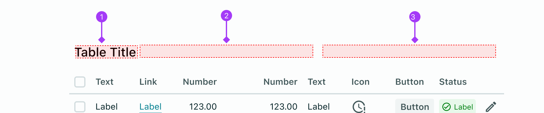
- Title - Text description of the table's data
- leftContent - any
ReactNodeor component - rightActions - array of
ButtonsorIconButtons
The Title displays a title above the table. The title is customisable via the title prop on the toolbarProps object.
() => {
  const columns = [
    { colId: "patientName", label: "Patient Name" },
    { colId: "age", label: "Age" },
    { colId: "dob", label: "Date of Birth" },
  ];

  const rows = [
    {
      id: "1",
      patientName: "Owens, Vera",
      age: "32",
      dob: "21/9/1989",
    },
    {
      id: "2",
      patientName: "Hooper, Diedre",
      age: "42",
    },
  ];

  const toolbarProps = {
    title: "Patients",
  };

  return (
    <Table toolbarProps={toolbarProps} columns={columns} tableData={rows} />
  );
};
The title can be one of three typography variants passed to the titleVariant prop:
pageTitlesectionTitle// default variantsectionSubtitle
() => {
  const columns = [
    { colId: "patientName", label: "Patient Name" },
    { colId: "age", label: "Age" },
    { colId: "dob", label: "Date of Birth" },
  ];

  const rows = [
    {
      id: "1",
      patientName: "Owens, Vera",
      age: "32",
      dob: "21/9/1989",
    },
    {
      id: "2",
      patientName: "Hooper, Diedre",
      age: "42",
    },
  ];

  const toolbarProps = {
    title: "Patients",
    titleVariant: "pageTitle",
  };

  return (
    <Table toolbarProps={toolbarProps} columns={columns} tableData={rows} />
  );
};
The leftContent prop can take any JSX element and will be rendered to the left of the title.
() => {
  const columns = [
    { colId: "patientName", label: "Patient Name" },
    { colId: "age", label: "Age" },
    { colId: "dob", label: "Date of Birth" },
  ];

  const rows = [
    {
      id: "1",
      patientName: "Owens, Vera",
      age: "32",
      dob: "21/9/1989",
    },
    {
      id: "2",
      patientName: "Hooper, Diedre",
      age: "42",
    },
  ];

  const toolbarProps = {
    title: "Patients",
    leftContent: (
      <Typography>Showing all patients aged between 30-45</Typography>
    ),
  };

  return (
    <Table toolbarProps={toolbarProps} columns={columns} tableData={rows} />
  );
};
The the right content is exclusively reserved for table actions that apply to the entire table. Right content can only display buttons and actions via the rightActions prop which takes an array of object and rendering the action based on these objects. You must assign a type to each object, these types include:
"button""iconButton"
You can then assign props to those components through a props attribute.
() => {
  const columns = [
    { colId: "patientName", label: "Patient Name" },
    { colId: "age", label: "Age" },
    { colId: "dob", label: "Date of Birth" },
  ];

  const rows = [
    {
      id: "1",
      patientName: "Owens, Vera",
      age: "32",
      dob: "21/9/1989",
    },
    {
      id: "2",
      patientName: "Hooper, Diedre",
      age: "42",
    },
  ];

  const toolbarProps = {
    title: "Patients",
    rightActions: [
      {
        type: "button",
        id: "add-new-button",
        props: {
          children: "Add",
          iconLeft: <Add />,
        },
      },
      {
        type: "iconButton",
        id: "icon-button-id",
        props: {
          icon: <Add />,
        },
      },
    ],
  };

  return (
    <Table toolbarProps={toolbarProps} columns={columns} tableData={rows} />
  );
};
When batch actions are enabled by passing selectableRows: true, and one or more items have been selected, a batch actions helper will pop up indicating how many items have been selected, and a button to select all or clear all items. This functionality will appear over the top of the toolbar title, left content and right actions. This behaviour is not optional.
Batch actions props
Configure the batch actions by passing an object to toolbarProps. This object can take an entityName, entityNamePluralised and an actions array for buttons that perform actions on all selected rows.
const toolbarProps = {
  batchActions: {
    entityName: "Patient",
    entityNamePluralised: "Patients",
    actions: [
      {
        type: "button",
        id: "resolve-all-button",
        props: {
          children: "Resolve all",
          onClick: () => {},
          // any other button props
        },
      },
    ],
  },
};
The default is to refer to the row entities as "Rows". These props determine the labels "1 Row selected" or "Select all x Rows". The pluralised version allows the table to render the correct grammar for one vs. multiple entities selected, and to handle unique cases of spelling like "entity" which pluralises to "entities", so cannot just have an "s" appended, however if only entityName is passed, table will append the entityName with an "s" behind the scenes.
() => {
  const [selectedRows, setSelectedRows] = React.useState([]);
  const emptyRowData = new Array(10).fill({});

  const rowData = emptyRowData.map((row, index) => ({
    id: `id-${index}`,
    textOne: `Row ${index + 1}`,
    textTwo: `Row ${index + 1}`,
    textThree: `Row ${index + 1}`,
    textFour: `Row ${index + 1}`,
    textFive: `Row ${index + 1}`,
  }));

  const columns = [
    { colId: "textOne", label: "Text" },
    { colId: "textTwo", label: "Text" },
    { colId: "textThree", label: "Text" },
    { colId: "textFour", label: "Text" },
    { colId: "textFive", label: "Text" },
  ];

  const toolbarProps = {
    title: "Table title",
    leftContent: <StatusBadge label="All reconciled" severity="success" />,
    rightActions: [
      {
        type: "button",
        id: "new-button",
        props: {
          children: "Add new",
          iconLeft: <Add />,
          onClick: () => alert("Added!"),
        },
      },
    ],
    batchActions: {
      entityName: "Patient",
      entityNamePluralised: "Patients",
      actions: [
        {
          type: "button",
          props: {
            children: "Export selected records",
            onClick: () =>
              alert("Exported rows: " + selectedRows.map((row) => row)),
          },
        },
      ],
    },
  };

  const selectChangeHandler = (action, state) => {
    setSelectedRows([...state.ids]);
  };

  return (
    <Table
      tableData={rowData}
      columns={columns}
      selectableRows
      toolbarProps={toolbarProps}
      onSelectChange={selectChangeHandler}
    />
  );
};
In cases where a table has no toolbar, the batch actions bar will appear "floating" above the table and will temporarily cover any content appearing before the table. This is to avoid requiring an empty space where the table's toolbar content would usually be, or pushing table values down from where they are initially rendered.
() => {
  const [selectedRows, setSelectedRows] = React.useState([]);
  const emptyRowData = new Array(10).fill({});

  const rowData = emptyRowData.map((row, index) => ({
    id: `row-id-${index}`,
    textOne: `Row ${index + 1}`,
    textTwo: `Row ${index + 1}`,
    textThree: `Row ${index + 1}`,
    textFour: `Row ${index + 1}`,
    textFive: `Row ${index + 1}`,
  }));

  const columns = [
    { colId: "textOne", label: "Text" },
    { colId: "textTwo", label: "Text" },
    { colId: "textThree", label: "Text" },
    { colId: "textFour", label: "Text" },
    { colId: "textFive", label: "Text" },
  ];

  const toolbarProps = {
    batchActions: {
      entityName: "Patient",
      entityNamePluralised: "Patients",
      actions: [
        {
          type: "button",
          id: "export-button-id",
          props: {
            children: "Export selected records",
            onClick: () =>
              alert("Exported rows: " + selectedRows.map((row) => row)),
          },
        },
      ],
    },
  };

  const selectChangeHandler = (action, state) => {
    setSelectedRows([...state.ids]);
  };

  return (
    <Table
      tableData={rowData}
      columns={columns}
      selectableRows
      toolbarProps={toolbarProps}
      onSelectChange={selectChangeHandler}
    />
  );
};
The onRowClick function continues to function as expected, but there is an additional behavior where a row is selected when it is clicked. Consequently, when a row is clicked, both the onRowClick function is triggered and the row is selected simultaneously.
() => {
  const columns = [
    { colId: "patientName", label: "Patient Name" },
    { colId: "age", label: "Age" },
    { colId: "dob", label: "Date of Birth" },
  ];

  const rows = [
    {
      id: "1",
      patientName: "Owens, Vera",
      age: "32",
      dob: "21/9/1989",
    },
    {
      id: "2",
      patientName: "Hooper, Diedre",
      age: "42",
    },
  ];

  const [selection, setSelection] = React.useState([]);
  const [value, setValue] = React.useState({});

  function handleOnClick(rowData) {
    setValue(rowData);
  }

  return (
    <Stack>
      <Table
        onSelectChange={(action, state) => {
          setSelection(state.ids);
        }}
        onRowClick={(rowData) => handleOnClick(rowData)}
        selectableRows={true}
        gridTemplateColumns="35px 1fr 1fr 1fr"
        columns={columns}
        tableData={rows}
      />
      <Typography variant="sectionSubtitle">Selected Rows</Typography>
      <Typography>Selected id's: {selection.join(", ")}</Typography>
      <Typography variant="sectionSubtitle">Data from click</Typography>
      <Typography>Patient name: {value.patientName}</Typography>
      <Typography>Age: {value.age}</Typography>
      <Typography>Date of birth: {value.dob}</Typography>
    </Stack>
  );
};
Some data sets are better presented in smaller snippets so they aren't overwhelming to read, or maybe space is limited, so it makes sense to break the data into smaller, iterable pages. Table allows this functionality through pagination, which creates smaller pages of the table data for the user to navigate through. The user can change how many rows are displayed per page to suit their preferences with a select input. If pagination is not applied, the table will grow infinitely in length.
() => {
  const emptyRowData = new Array(75).fill({});

  const rowData = emptyRowData.map((row, index) => ({
    id: `id-row-${index}`,
    textOne: `Row ${index + 1}`,
    textTwo: `Row ${index + 1}`,
    textThree: `Row ${index + 1}`,
    textFour: `Row ${index + 1}`,
    textFive: `Row ${index + 1}`,
  }));

  const columns = [
    { colId: "textOne", label: "Text" },
    { colId: "textTwo", label: "Text" },
    { colId: "textThree", label: "Text" },
    { colId: "textFour", label: "Text" },
    { colId: "textFive", label: "Text" },
  ];

  return (
    <Table
      tableData={rowData}
      columns={columns}
      pagination
      selectableRows={true}
    />
  );
};
Developers can customise what the rows per page options are by passing an object to pagination with the rowsPerPageOptions key, and an array of numbers as the value. The default is to offer 25, 50 or 75 rows per page.
() => {
  const emptyRowData = new Array(26).fill({});

  const rowData = emptyRowData.map((row, index) => ({
    id: `uuid-id-${index}`,
    textOne: `Row ${index + 1}`,
    textTwo: `Row ${index + 1}`,
    textThree: `Row ${index + 1}`,
    textFour: `Row ${index + 1}`,
  }));

  const columns = [
    { colId: "textOne", label: "Text", cellType: "text" },
    { colId: "textTwo", label: "Text", cellType: "text" },
    { colId: "textThree", label: "Text", cellType: "text" },
    { colId: "textFour", label: "Text", cellType: "text" },
  ];

  const pagination = {
    rowsPerPageOptions: [1, 2, 3, 5, 8, 13],
  };

  return (
    <Table tableData={rowData} columns={columns} pagination={pagination} />
  );
};
Data within the table can be ordered by a column's data type. This helps to sort the table alphabetically, numerically or any other valid way to sort data with Javascript's .sort() function - learn more here. Pass sortable: true to have a simple sort comparison function applied to your column (this function will assume the data exists on the colId associated with this column). Alternatively, customise the sort function by passing any valid .sort() callback function to sortable.
Users can set a default sort on a column so this is how the table is ordered on first load. Simply pass isDefaultSort: true to that column. Note this will only apply if a sortable boolean or function is also passed, and should only be passed to one column.
() => {
  const columns = [
    {
      colId: "patientName",
      label: "Patient Name",
    },
    {
      colId: "dob",
      label: "Date of Birth",
      sortable: (a, b) => {
        const c = a.dob.split("/"); // ["DD", "MM", "YYYY"]
        const d = b.dob.split("/");
        return c[2] - d[2] || c[1] - d[1] || c[0] - d[0];
      },
    },
    {
      colId: "appointment",
      cellType: "statusBadge",
      label: "Appointment Status",
      sortable: true,
      isDefaultSort: true,
      getCellProps: (colId, rowData) => {
        if (rowData[colId]) {
          return {
            severity: "success",
            label: "Confirmed",
          };
        }
        return {
          severity: "critical",
          label: "Pending",
        };
      },
    },
  ];

  const rows = [
    {
      id: "1",
      patientName: "Vera Owens",
      dob: "21/10/1989",
      appointment: true,
    },
    {
      id: "2",
      patientName: "Diedre Hooper",
      dob: "20/10/1989",
      appointment: false,
    },
    {
      id: "3",
      patientName: "Annabelle Smith",
      dob: "16/03/1994",
      appointment: false,
    },
    {
      id: "4",
      dob: "20/10/1989",
      patientName: "Matt Smith",
      appointment: true,
    },
    {
      id: "5",
      patientName: "Thomas",
      dob: "22/01/2013",
      appointment: true,
    },
    {
      id: "6",
      patientName: "Wendy Cooper",
      dob: "01/10/1961",
      appointment: true,
    },
  ];

  return <Table columns={columns} tableData={rows} />;
};
If there is no available cell data, Table will render a text cell with a - by default. Any string can be passed to Table via the emptyPlaceholderText prop to customise what is returned.
() => {
  const getLinkPropsForItem = (colId, rowData) => ({
    href: `http://mysite.com/${rowData.recordId}`,
    children: "View Record",
  });

  const columns = [
    {
      colId: "name",
      label: "Name",
      cellType: "text",
    },
    {
      colId: "dob",
      label: "Date of Birth",
      cellType: "text",
    },
    {
      colId: "billingStatus",
      label: "Billing Status",
      cellType: "statusBadge",
      getCellProps: (colId, rowData) => {
        if (rowData[colId]) {
          const statusLabel = rowData[colId].split("_");
          if (statusLabel.length === 3) {
            return {
              severity: "success",
              label: `${statusLabel[0]} ${statusLabel[1]} ${statusLabel[2]}`,
            };
          }
          return {
            severity: "critical",
            label: `${statusLabel[0]} `,
          };
        }
      },
    },
    {
      colId: "recordId",
      label: "Records",
      cellType: "link",
      getCellProps: getLinkPropsForItem,
    },
  ];

  const tableData = [
    {
      id: "1",
      name: "McLeod, Sam",
      dob: 0,
      billingStatus: "up_to_date",
      recordId: "123",
    },
    {
      id: "2",
      name: "Owens, Vera",
      dob: null,
      billingStatus: "overdue",
      recordId: "123",
    },
    {
      id: "3",
      name: "Mays, Thomas",
      billingStatus: null,
      recordId: "123",
    },
    {
      id: "4",
      name: "Hooper, Diedre",
      dob: "02/02/1958",
      billingStatus: "overdue",
      recordId: "123",
    },
  ];

  return (
    <Stack spacing="xl">
      <Typography variant="sectionTitle">Default placeholder text</Typography>
      <Table columns={columns} tableData={tableData} />
      <Typography variant="sectionTitle">
        Example with custom placeholder text
      </Typography>
      <Table
        columns={columns}
        tableData={tableData}
        emptyPlaceholderText="n/a"
      />
    </Stack>
  );
};
In order to assist readability, the table highlights row contents on hover, even tables without an onRowClick function. To opt out of this behaviour, pass rowHighlight={false} to the table component. If your table has an onRowClick function, you cannot opt out of row highlighting.
() => {
  const columns = [
    {
      colId: "name",
      label: "Name",
      cellType: "text",
    },
    {
      colId: "dob",
      label: "Date of Birth",
      cellType: "text",
    },
    {
      colId: "billingStatus",
      label: "Billing Status",
      cellType: "statusBadge",
      getCellProps: (colId, rowData) => {
        if (rowData[colId]) {
          const statusLabel = rowData[colId].split("_");
          if (statusLabel.length === 3) {
            return {
              severity: "success",
              label: `${statusLabel[0]} ${statusLabel[1]} ${statusLabel[2]}`,
            };
          }
          return {
            severity: "critical",
            label: `${statusLabel[0]} `,
          };
        }
      },
    },
  ];

  const tableData = [
    {
      id: "1",
      name: "McLeod, Sam",
      dob: "12/12/2000",
      billingStatus: "up_to_date",
    },
    {
      id: "2",
      name: "Owens, Vera",
      dob: null,
      billingStatus: "overdue",
    },
    {
      id: "3",
      name: "Mays, Thomas",
      billingStatus: null,
    },
    {
      id: "4",
      name: "Hooper, Diedre",
      dob: "02/02/1958",
      billingStatus: "overdue",
    },
  ];

  const [rowHighlight, setRowHighlight] = React.useState(true);

  return (
    <Stack spacing="md">
      <DocsFlex
        spacing="xl"
        justify="between"
        direction="horizontal"
        css={{ width: "100%" }}
      >
        <Typography variant="sectionTitle">
          Row Highlighting: {rowHighlight ? "Enabled" : "Disabled"}
        </Typography>
        <Tooltip content="Toggle row highlighting">
          <Switch
            id="compact"
            checked={rowHighlight}
            onCheckedChange={() => setRowHighlight(!rowHighlight)}
          />
        </Tooltip>
      </DocsFlex>
      <Table
        rowHighlight={rowHighlight}
        columns={columns}
        tableData={tableData}
      />
    </Stack>
  );
};
Tables with large amounts of data can take up a lot of vertical space due to their default padding. The size prop in Vitality tables provides a solution for this issue. By setting size="compact", the padding, minimum row height and text sizes are decreased, enabling more entries to be displayed in a smaller area.
() => {
  const getLinkPropsForItem = (colId, rowData) => ({
    href: `http://mysite.com/${rowData.recordId}`,
    children: "View Record",
  });

  const columns = [
    {
      colId: "name",
      label: "Name",
      cellType: "text",
    },
    {
      colId: "dob",
      label: "Date of Birth",
      cellType: "text",
    },
    {
      colId: "billingStatus",
      label: "Billing Status",
      cellType: "statusBadge",
      getCellProps: (colId, rowData) => {
        if (rowData[colId]) {
          const statusLabel = rowData[colId].split("_");
          if (statusLabel.length === 3) {
            return {
              severity: "success",
              label: `${statusLabel[0]} ${statusLabel[1]} ${statusLabel[2]}`,
            };
          }
          return {
            severity: "critical",
            label: `${statusLabel[0]} `,
          };
        }
      },
    },
    {
      colId: "recordId",
      label: "Records",
      cellType: "link",
      getCellProps: getLinkPropsForItem,
    },
  ];

  const tableData = [
    {
      id: "1",
      name: "McLeod, Sam",
      dob: "12/12/2000",
      billingStatus: "up_to_date",
      recordId: "123",
    },
    {
      id: "2",
      name: "Owens, Vera",
      dob: null,
      billingStatus: "overdue",
      recordId: "123",
    },
    {
      id: "3",
      name: "Mays, Thomas",
      billingStatus: null,
      recordId: "123",
    },
    {
      id: "4",
      name: "Hooper, Diedre",
      dob: "02/02/1958",
      billingStatus: "overdue",
      recordId: "123",
    },
  ];

  const [compact, setCompact] = React.useState(false);

  return (
    <Stack spacing="md">
      <DocsFlex
        spacing="xl"
        justify="between"
        direction="horizontal"
        css={{ width: "100%" }}
      >
        <Typography variant="sectionTitle">
          {compact ? "Compact" : "Default"} size
        </Typography>
        <Tooltip content="Toggle compact or default size">
          <Switch
            id="compact"
            checked={compact}
            onCheckedChange={() => setCompact(!compact)}
          />
        </Tooltip>
      </DocsFlex>
      <Table
        size={compact && "compact"}
        columns={columns}
        tableData={tableData}
      />
    </Stack>
  );
};
Assign column widths for your table with the gridTemplateColumns prop. This works in the same way as the CSS attribute grid-template-columns so if you're unfamiliar with this property, please see MDN documentation or CSS-Tricks guide.
Note that the index of your column object must match the index of the gridTemplateColumn value, and that passing the wrong number of columns will break the layout. When the total width of all columns exceeds the available space for the table, horizontal scrolling will apply to the overflow.
() => {
  return (
    <Stack>
      <Typography variant="sectionSubtitle">
        gridTemplateColumns: 1fr 250px 20%
      </Typography>
      <Table
        columns={[
          { colId: "oneFraction", label: "1fr", cellType: "text" },
          { colId: "pixels", label: "250px", cellType: "text" },
          { colId: "twentyPercent", label: "20%", cellType: "text" },
        ]}
        tableData={[
          {
            id: "1",
            oneFraction: "One fraction",
            pixels: "250 pixels",
            twentyPercent: "20 percent",
          },
        ]}
        gridTemplateColumns="1fr 250px 20%"
      />
    </Stack>
  );
};
If a column should be resizable, pass resize: true to that column's object and a resizer will appear on hover. Drag and drop this resizer to adjust the column width.
() => {
  const rows = [
    {
      id: "1",
      name: "McLeod, Sam",
      patientNotes:
        "Lorem ipsum dolor sit amet, consectetur adipiscing elit. Donec commodo ligula in sem suscipit, nec molestie urna congue. Pellentesque habitant morbi tristique senectus et netus et malesuada fames ac turpis egestas.",
      billingStatus: "up_to_date",
    },
    {
      id: "2",
      name: "Owens, Vera",
      billingStatus: "overdue",
    },
    {
      id: "3",
      name: "Mays, Thomas",
      billingStatus: null,
    },
    {
      id: "4",
      name: "Hooper, Diedre",
      patientNotes:
        "Lorem ipsum dolor sit amet, consectetur adipiscing elit. Donec commodo ligula in sem suscipit, nec molestie urna congue. Pellentesque habitant morbi tristique senectus et netus et malesuada fames ac turpis egestas.",
      billingStatus: "overdue",
    },
  ];

  const columns = [
    {
      colId: "name",
      label: "Name",
      cellType: "text",
      resize: true,
    },
    {
      colId: "patientNotes",
      label: "Notes",
      cellType: "text",
      resize: true,
      getCellProps: (colId, rowData) => {
        return {
          wrap: true,
          children: rowData[colId],
        };
      },
    },
    {
      colId: "billingStatus",
      label: "Billing",
      cellType: "statusBadge",
      getCellProps: (colId, rowData) => {
        if (rowData[colId] === "overdue") {
          return {
            icon: <Error />,
            severity: "critical",
            label: "Overdue",
          };
        }
        if (rowData[colId] === "up_to_date") {
          return {
            icon: <Done />,
            severity: "success",
            label: "Up to date",
          };
        }
      },
    },
  ];
  return (
    <Table
      columns={columns}
      tableData={rows}
      gridTemplateColumns="2fr 5fr 1fr"
    />
  );
};
Storing adjusted column widths
If the columns are adjustable, and you need to know what the new value of the widths are, to store them as user preferences for example, use the onLayoutChange callback. This returns a string with the new gridTemplateColumns value in px.
() => {
  const [layoutValue, setLayoutValue] = React.useState();
  const rows = [
    {
      id: "1",
      name: "McLeod, Sam",
      patientNotes:
        "Lorem ipsum dolor sit amet, consectetur adipiscing elit. Donec commodo ligula in sem suscipit, nec molestie urna congue. Pellentesque habitant morbi tristique senectus et netus et malesuada fames ac turpis egestas.",
    },
    {
      id: "2",
      name: "Hooper, Diedre",
      patientNotes:
        "Lorem ipsum dolor sit amet, consectetur adipiscing elit. Donec commodo ligula in sem suscipit, nec molestie urna congue.",
    },
    {
      id: "3",
      name: "Thompson, Rose-Marie",
      patientNotes:
        "Lorem ipsum dolor sit amet, consectetur adipiscing elit. Donec commodo ligula in sem suscipit, nec molestie urna congue.",
    },
  ];

  const columns = [
    {
      colId: "name",
      label: "Name",
      cellType: "text",
      resize: true,
    },
    {
      colId: "patientNotes",
      label: "Notes",
      cellType: "text",
      resize: true,
      getCellProps: (colId, rowData) => {
        return {
          wrap: true,
          children: rowData[colId],
        };
      },
    },
  ];

  return (
    <Stack>
      <Table
        onLayoutChange={(newLayout) => setLayoutValue(newLayout)}
        columns={columns}
        tableData={rows}
        gridTemplateColumns="minmax(10px, 1fr) minmax(10px, 5fr)"
      />
      <Typography variant="body">
        Returned layout value: {layoutValue}
      </Typography>
    </Stack>
  );
};
To change the state of the table based on it's current status you can access the statusProps of the table. By changing the status in statusProps the state will change.
When status: "loading" is set, the table data will be replaced with a loading Spinner, providing a visual indication to users that an asynchronous call is being made. This loading Spinner is styled for both compact and default table sizes.
() => {
  const getLinkPropsForItem = (colId, rowData) => ({
    href: `http://mysite.com/${rowData.recordId}`,
  });

  const columns = [
    {
      colId: "name",
      label: "Name",
      cellType: "text",
    },
    {
      colId: "dob",
      label: "Date of Birth",
      cellType: "text",
    },
    {
      colId: "billingStatus",
      label: "Billing Status",
      cellType: "statusBadge",
      getCellProps: (colId, rowData) => {
        if (rowData[colId]) {
          const statusLabel = rowData[colId].split("_");
          if (statusLabel.length === 3) {
            return {
              severity: "success",
              label: `${statusLabel[0]} ${statusLabel[1]} ${statusLabel[2]}`,
            };
          }
          return {
            severity: "critical",
            label: `${statusLabel[0]} `,
          };
        }
      },
    },
  ];

  const tableData = [
    {
      id: "1",
      name: "McLeod, Sam",
      dob: "12/12/2000",
      billingStatus: "up_to_date",
    },
    {
      id: "2",
      name: "Owens, Vera",
      dob: null,
      billingStatus: "overdue",
    },
  ];

  const [compact, setCompact] = React.useState(false);

  return (
    <DocsFlex justify="between" direction="column" css={{ width: "100%" }}>
      <DocsFlex justify="between" css={{ width: "100%" }}>
        <Typography variant="sectionTitle">
          {compact ? "Compact" : "Default"} size
        </Typography>
        <Tooltip content="Toggle compact or default size">
          <Switch
            id="compact"
            checked={compact}
            onCheckedChange={() => setCompact(!compact)}
          />
        </Tooltip>
      </DocsFlex>
      <Table
        statusProps={{
          status: "loading",
        }}
        size={compact ? "compact" : "default"}
        columns={columns}
        tableData={tableData}
      />
    </DocsFlex>
  );
};
To display an error message when an error occurs, set status: "error". This will replace the table data with a preset error message that can be customised with the errorMessage property. The Error state styling for both "default" and "compact" table sizes.
There is an option to render a button with an onClick function which would enable users to do something else once an error occurs. This is commonly used to retry a function that may have previously failed or caused the error. You can access the button's props using the errorButtonProps prop on the statusProps. If you do not provide an onClick function to errorButtonProps, the button will not be displayed. To further customize the button, you can use the label prop of errorButtonProps to set a more specific label.
() => {
  const getLinkPropsForItem = (colId, rowData) => ({
    href: `http://mysite.com/${rowData.recordId}`,
  });

  const columns = [
    {
      colId: "name",
      label: "Name",
      cellType: "text",
    },
    {
      colId: "dob",
      label: "Date of Birth",
      cellType: "text",
    },
    {
      colId: "billingStatus",
      label: "Billing Status",
      cellType: "statusBadge",
      getCellProps: (colId, rowData) => {
        if (rowData[colId]) {
          const statusLabel = rowData[colId].split("_");
          if (statusLabel.length === 3) {
            return {
              severity: "success",
              label: `${statusLabel[0]} ${statusLabel[1]} ${statusLabel[2]}`,
            };
          }
          return {
            severity: "critical",
            label: `${statusLabel[0]} `,
          };
        }
      },
    },
  ];

  const tableData = [
    {
      id: "1",
      name: "McLeod, Sam",
      dob: "12/12/2000",
      billingStatus: "up_to_date",
    },
    {
      id: "2",
      name: "Owens, Vera",
      dob: null,
      billingStatus: "overdue",
    },
  ];

  const [compact, setCompact] = React.useState(false);

  return (
    <DocsFlex justify="between" direction="column" css={{ width: "100%" }}>
      <DocsFlex justify="between" css={{ width: "100%" }}>
        <Typography variant="sectionTitle">
          {compact ? "Compact" : "Default"} size
        </Typography>
        <Tooltip content="Toggle compact or default size">
          <Switch
            id="compact"
            checked={compact}
            onCheckedChange={() => setCompact(!compact)}
          />
        </Tooltip>
      </DocsFlex>
      <Table
        statusProps={{
          status: "error",
          errorButtonProps: {
            onClick: (event) => alert("Re-loading the table"),
          },
        }}
        size={compact ? "compact" : "default"}
        columns={columns}
        tableData={tableData}
      />
    </DocsFlex>
  );
};
If no statusProps are provided, the table will display data. However, if the tableData is empty, the table will show up an empty state.
() => {
  const getLinkPropsForItem = (colId, rowData) => ({
    href: `http://mysite.com/${rowData.recordId}`,
  });

  const columns = [
    {
      colId: "name",
      label: "Name",
      cellType: "text",
    },
    {
      colId: "dob",
      label: "Date of Birth",
      cellType: "text",
    },
    {
      colId: "billingStatus",
      label: "Billing Status",
      cellType: "statusBadge",
      getCellProps: (colId, rowData) => {
        if (rowData[colId]) {
          const statusLabel = rowData[colId].split("_");
          if (statusLabel.length === 3) {
            return {
              severity: "success",
              label: `${statusLabel[0]} ${statusLabel[1]} ${statusLabel[2]}`,
            };
          }
          return {
            severity: "critical",
            label: `${statusLabel[0]} `,
          };
        }
      },
    },
  ];

  const tableData = [];

  const [compact, setCompact] = React.useState(false);

  return (
    <DocsFlex justify="between" direction="column" css={{ width: "100%" }}>
      <DocsFlex justify="between" css={{ width: "100%" }}>
        <Typography variant="sectionTitle">
          {compact ? "Compact" : "Default"} size
        </Typography>
        <Tooltip content="Toggle compact or default size">
          <Switch
            id="compact"
            checked={compact}
            onCheckedChange={() => setCompact(!compact)}
          />
        </Tooltip>
      </DocsFlex>
      <Table
        size={compact ? "compact" : "default"}
        columns={columns}
        tableData={tableData}
      />
    </DocsFlex>
  );
};
You can customise this text with the emptyMessage prop of statusProps
() => {
  const getLinkPropsForItem = (colId, rowData) => ({
    href: `http://mysite.com/${rowData.recordId}`,
  });

  const columns = [
    {
      colId: "name",
      label: "Name",
      cellType: "text",
    },
    {
      colId: "dob",
      label: "Date of Birth",
      cellType: "text",
    },
    {
      colId: "billingStatus",
      label: "Billing Status",
      cellType: "statusBadge",
      getCellProps: (colId, rowData) => {
        if (rowData[colId]) {
          const statusLabel = rowData[colId].split("_");
          if (statusLabel.length === 3) {
            return {
              severity: "success",
              label: `${statusLabel[0]} ${statusLabel[1]} ${statusLabel[2]}`,
            };
          }
          return {
            severity: "critical",
            label: `${statusLabel[0]} `,
          };
        }
      },
    },
  ];

  const tableData = [];

  const [compact, setCompact] = React.useState(false);

  return (
    <DocsFlex justify="between" direction="column" css={{ width: "100%" }}>
      <DocsFlex justify="between" css={{ width: "100%" }}>
        <Typography variant="sectionTitle">
          {compact ? "Compact" : "Default"} size
        </Typography>
        <Tooltip content="Toggle compact or default size">
          <Switch
            id="compact"
            checked={compact}
            onCheckedChange={() => setCompact(!compact)}
          />
        </Tooltip>
      </DocsFlex>
      <Table
        size={compact ? "compact" : "default"}
        statusProps={{
          emptyMessage: "No matching patients found",
        }}
        columns={columns}
        tableData={tableData}
      />
    </DocsFlex>
  );
};
Description
Configuration of the columns including their labels and cell rendering.
Type
Columns<CellTypes>
Description
The row active by default when the table is first rendered. Does not actually call the onRowClick function just styles the row as if its been clicked.
Type
string
Description
The row(s) selected by default when the table is first rendered.
Type
string[]
Description
The string that renders when no data is available for a particular cell.
Type
string
Default Value
"-"
Description
String that determines the widths of individual columns based on the CSS property grid-template-columns, see https://developer.mozilla.org/en-US/docs/Web/CSS/grid-template-columns for more
Type
string
Type
string
Default Value
default
Description
Returns the string value of grid-template-columns after columns have been resized, useful for storing width preferences
Type
(newLayout: string) => void
Description
Specifies a function to trigger on row click and contains the data of the row (rowData`) and the event (`event).
Type
RowOnClickType
Description
the function that triggers when the selected state changes contains both the changing action and the state of all selected id's
Type
MiddlewareFunction
Description
Enables users to navigate through pages in a table. Useful for large data sets or when using table in a limited space. Option to pass an array of numbers which gives the developer freedom to set the options in the rows / page select, which determines how many rows can be displayed per page. The user ultimately decides how many rows to display but the developer controls the choices.
Type
boolean | PaginationProps
Description
Determines whether the on hover highlighting is visible on tables without a onRowClick function.
Type
boolean
Default Value
Description
Enables row selection and places checkboxes at the start of the table's first column.
Type
boolean
Description
Determines whether the table is compact or not. size="compact" reduces padding between rows to increase the number of entries that can fit on the screen
Type
"default" | "compact"
Default Value
default
Type
TableStatusProps
Default Value
{ status: null }
Description
The table's data
Type
RowData[]
Description
The props for the Toolbar section
Type
ToolbarProps<"iconButton" | "button">