
Toaster
The Toaster enables the display of short on-screen messages, known as toast notifications, that inform you of significant updates or events.
import { Toaster } from "@vitality-ds/components";
Call the Toaster component at the root level of your app. This is to handle all Toasts in one array to make sure they do not overlap when multiple are rendered at the same time from different parts of your app, and to limit the number on screen to three at a time. Where new Toasts are created within the app should add or remove toasts to the array passed to the root level Toaster.
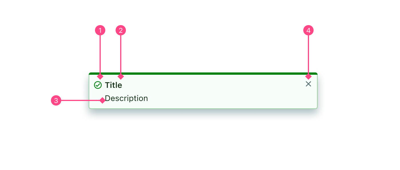
- Icon: Used to aid in the communication of the type of notification (for eg. tick for success, 'i' for info).
- Title: Title of the Toast to give immediate context - "Successfully saved"
- Message: Text to communicate more context or detail for the Toast - "You can now find this entry in your calendar"
- Close button: "X" icon button that closes the Toast.
() => {
  const [toasts, setToasts] = React.useState([]);

  const handleClose = (toastId) => {
    setToasts(toasts.filter((t) => t.id !== toastId));
  };

  const addToast = (type, title, message, options) => {
    setToasts([
      ...toasts,
      { id: Math.floor(Math.random() * 100), type, title, message, options },
    ]);
  };

  return (
    <>
      <Toaster toasts={toasts} onClose={handleClose} />
      <Button onClick={() => addToast("success", "Title", "Message", {})}>
        Toast
      </Button>
    </>
  );
};
There are 5 types of toast:
These types effect the colouring and styles of the Toast, which follow the Feedback Colours guide to better communicate the toasts message. Icons are also determined by the toast type.
To change the toast type, simply modify the type key in the object being passed to the toasts array.
Success toasts are used to communicate when something has been successful or there has been a positive result from some type of workflow, process or action. Some common use cases includes successfully creating, updating or deleting something.
() => {
  const [toasts, setToasts] = React.useState([]);

  const handleClose = (toastId) => {
    setToasts(toasts.filter((t) => t.id !== toastId));
  };

  const addToast = (type) => {
    setToasts([
      ...toasts,
      {
        id: Math.floor(Math.random() * 100),
        type,
        title: "Changes Saved",
        message: "Your appointment has now been updated",
        options: {},
      },
    ]);
  };

  return (
    <Stack spacing="md" align="center">
      <Toaster toasts={toasts} onClose={handleClose} />
      <Button onClick={() => addToast("success")}>Save</Button>
    </Stack>
  );
};
Warning toasts are used to communicate potentially harmful actions, information or notices. A common use case includes trying to perform an action with missing data.
() => {
  const [toasts, setToasts] = React.useState([]);

  const handleClose = (toastId) => {
    setToasts(toasts.filter((t) => t.id !== toastId));
  };

  const addToast = (type) => {
    setToasts([
      ...toasts,
      {
        id: Math.floor(Math.random() * 100),
        type,
        title: "Letter does not exist",
        message: "Sending the might have unintended consequences",
        options: {},
      },
    ]);
  };

  return (
    <Stack spacing="md" align="center">
      <Toaster toasts={toasts} onClose={handleClose} />
      <Button onClick={() => addToast("warning")}>Send</Button>
    </Stack>
  );
};
Error toasts are used to communicate when an error has occurred, or the failed outcome of a transaction, process or workflow. They are commonly used to indicate an inability to fetch something, or failure to create, update or delete something.
() => {
  const [toasts, setToasts] = React.useState([]);

  const handleClose = (toastId) => {
    setToasts(toasts.filter((t) => t.id !== toastId));
  };

  const addToast = (type) => {
    setToasts([
      ...toasts,
      {
        id: Math.floor(Math.random() * 100),
        type,
        title: "Failed to send",
        message: "Something went wrong, please try again.",
        options: {},
      },
    ]);
  };

  return (
    <Stack spacing="md" align="center">
      <Toaster toasts={toasts} onClose={handleClose} />
      <Button onClick={() => addToast("error")}>Send</Button>
    </Stack>
  );
};
Toasts with the Info type are designed to communicate generalised information that is relevant to the user. This information is usually useful and non-critical. A common use case includes status updates, or communicating new information compared to a previous user experience.
() => {
  const [toasts, setToasts] = React.useState([]);

  const handleClose = (toastId) => {
    setToasts(toasts.filter((t) => t.id !== toastId));
  };

  const addToast = (type) => {
    setToasts([
      ...toasts,
      {
        id: Math.floor(Math.random() * 100),
        type,
        title: "Prescription is Exporting",
        message: "Downloading",
        options: {},
      },
    ]);
  };

  return (
    <Stack spacing="md" align="center">
      <Toaster toasts={toasts} onClose={handleClose} />
      <Button onClick={() => addToast("info")}>Export</Button>
    </Stack>
  );
};
General Toasts are used to communicate information that is non-critical, likely helpful updates, that require no response. A use case might be to notify users that a system update has taken place. Typically, this type of Toast will be the least commonly used.
() => {
  const [toasts, setToasts] = React.useState([]);

  const handleClose = (toastId) => {
    setToasts(toasts.filter((t) => t.id !== toastId));
  };

  const addToast = (type) => {
    setToasts([
      ...toasts,
      {
        id: Math.floor(Math.random() * 100),
        type,
        title: "Version Update",
        message: "Now using version 2.9.4.",
        options: {},
      },
    ]);
  };

  return (
    <Stack spacing="md" align="center">
      <Toaster toasts={toasts} onClose={handleClose} />
      <Button onClick={() => addToast("general")}>General</Button>
    </Stack>
  );
};
A Toast is made up of an icon, title, message and a close button. The title and close button are required values, however the icon and message are optional. If you're confident the title is enough text to convey the message of the Toast, simply pass null, undefined or an empty string "" to the message prop.
The title should be short, concise and utilise sentence casing.
Hiding the icon can be configured with the Toast options, though the type of icon is predetermined by the type and cannot be changed.
const toastOptions = {
  hideIcon: true,
};
() => {
  const [toasts, setToasts] = React.useState([]);

  const handleClose = (toastId) => {
    setToasts(toasts.filter((t) => t.id !== toastId));
  };

  const addToast = (type, title, message, options) => {
    setToasts([
      ...toasts,
      { id: Math.floor(Math.random() * 100), type, title, message, options },
    ]);
  };

  const successToastr = (title, message, options) => {
    addToast("success", title, message, options);
  };

  return (
    <Stack spacing="md" align="center">
      <Toaster toasts={toasts} onClose={handleClose} />
      <Button
        shouldFitContainer
        onClick={() => successToastr("Title", null, {})}
      >
        No message
      </Button>
      <Button
        shouldFitContainer
        onClick={() =>
          successToastr("Title", "Message", {
            hideIcon: true,
          })
        }
      >
        No icon
      </Button>
      <Button
        shouldFitContainer
        onClick={() =>
          successToastr(
            "Title",
            "Lorem ipsum dolor sit amet, consectetur adipiscing elit. Nullam vulputateeros arcu, a vehicula urna sagittis in. Duis libero justo, vehicula at duia, luctus maximus elit. Nulla quis orci vel diam placerat porta et sit amet nunc.",
            {
              hideIcon: true,
            }
          )
        }
      >
        Big message
      </Button>
      <Button
        shouldFitContainer
        onClick={() =>
          successToastr(
            "Title",
            "Lorem ipsum dolor sit amet, consectetur adipiscing elit. Nullam vulputateeros arcu, a vehicula urna sagittis in. Duis libero justo, vehicula at duia, luctus maximus elit. Nulla quis orci vel diam placerat porta et sit amet nunc.",
            {}
          )
        }
      >
        Big message & icon
      </Button>
    </Stack>
  );
};
A Toast will appear to communicate something to the user, and then disappear after 5 seconds. If the user hovers their mouse over the Toast, it will pause this duration countdown until the mouse is no longer hovering, and resume counting down from its previous duration. Toasts are generally not supposed to require a response from the user, hence they disappear on their own. However should the content be significant enough that it must be manually closed before it can disappear (indicating a user has definitely seen it), then you have the option to pass indefinite to the Toast. This breaks the conventional use case for a Toast notification, so consider if a ModalDialog is a better option. Its important to note that a maximum of three Toasts will appear on the screen at a given time. If you choose to use indefinite Toasts, there is the potential that other important notifications are waiting in the queue indefinitely too.
() => {
  const [toasts, setToasts] = React.useState([]);

  const handleClose = (toastId) => {
    setToasts(toasts.filter((t) => t.id !== toastId));
  };

  const addToast = (type, title, message, options) => {
    setToasts([
      ...toasts,
      { id: Math.floor(Math.random() * 100), type, title, message, options },
    ]);
  };

  const successToastr = (title, message, options) => {
    addToast("success", title, message, options);
  };

  return (
    <Stack spacing="md" align="center">
      <Toaster toasts={toasts} onClose={handleClose} />
      <Button
        shouldFitContainer
        onClick={() => successToastr("Title", "Message", { indefinite: true })}
      >
        Indefinite Toast
      </Button>
    </Stack>
  );
};
The icon in the toast is determined by the type and cannot be changed, but it can be hidden with the hideIcon boolean. You might choose to hide an icon if there is a lot of text within the toast and it risks removing value from the message, or the extra white space is necessary.
const toast = {
  type: "success",
  title: "Title",
  message: "",
  options: { hideIcon: true, indefinite: false },
};
Type
() => void
Type
ToastType[]
Type
boolean
Type
string
Type
() => void
Type
string