
Color
Understand the color system in Vitality
Products built with Vitality should make use of color in meaningful ways and should avoid adding unncessary "flare". This approach allows the dimension of color to communicate meaning and direct the user's eye toward what's important in an interaction. It's okay if an interface feels plain if it is focused on supporting the user's goals.
Vitality's color system is designed to meet WCAG AA standards across all color scales and use cases. Our automated test suite validates contrast ratios to ensure accessibility compliance.
For text on app backgrounds (steps 1-3), all text colors meet WCAG AA requirements:
- High contrast text (step 12): ≥4.5:1 contrast ratio on steps 1, 2, and 3
- Low contrast text (step 11): ≥4.5:1 contrast ratio on steps 1, 2, and 3
- Step 11 maintains lower contrast than step 12 to provide visual hierarchy while remaining accessible
For text on high-saturation solid backgrounds (step 10):
- High contrast text on solid (step 13): ≥4.5:1 contrast ratio, approaching white/black for maximum readability
- Low contrast text on solid (step 14): 4.5-6.5:1 contrast ratio for secondary content
- Step 14 provides visual hierarchy by maintaining lower contrast than step 13 while remaining fully accessible
For high saturation text/graphics (step 10) on UI element backgrounds (step 3):
- Meets ≥3:1 contrast ratio for large text, graphics, and UI components (WCAG AA Large Text)
- Not suitable for normal-sized body text - use step 11 or 12 instead
- Best used for icons, large headings, or interactive elements on colored backgrounds
Most colors used in Vitality components are designed to communicate particular meaning to the user.
These colors should comprise the majority of a product's interface.
Neutral
Base color for most of the interface.
Primary
Used for key interactive elements, like buttons and links, to guide users toward important actions.
Accent
Draw attention to important notifications.
Use severity colors to communicate different levels of importance to the user. Common use cases include successes, errors, urgency or overdue statuses – or generally-informative "info" content. Because the majority of the interface uses neutral colors, using these colors in key moments / areas of the interface will help direct the user's eye. Although part of the core colors, accent is also available in the severity colors.
Info
Deliver useful, non-critical information to the user.
Accent
Draw attention to important notifications.
Success
Indicate the positive result of a transaction, process or workflow.
Warning
Draw attention to potentially-harmful actions, information or notices.
Critical
Indicate the negative result of a transaction, process or workflow.
You may notice certain components use different "amounts" of a core color (like the above examples - text uses primary color with a lighter version of that color for the background). They also have colors set for active and hovered states. Each of these core colors comprises a "scale" of color. Each scale contains different tints of a particular color.
The Magentus violet color palette is included in Vitality for instances where the brand needs to be represented. This color should be used sparingly and only in areas where the brand needs to be communicated. It can be used in conjunction with the accent color scale to make up the key Magentus colors.
Brand
Reserved for app logos and any key moments where our brand is represented.
Below illustrates generally the balance of color that should be used in interfaces. As shown, the majority of the interface should be neutral, utilising color in limited, key moments.
- Use primary colors to highlight primary actions
- Use severity colors to communicate the severity of messages from the system
- Use the accent color to draw attention to important notifications
- Using colors to "decorate" an interface
- Mis-using the functional colors and communicating conflicting information (eg. Green text communicating a negative message)
If you aren't creating new components and simply using Vitality's pre-existing components, refer to each individual component's documentation for more detailed guidance on the use case for color.
Read on if you need to develop your own components or are creating new components for Vitality.
When creating new components, Vitality provides a helper function that allows you to specify a scale (eg. primary, accent, success, critical etc.) and a use case. This function returns a color name that maps to a "step" in the scale of color.
For designers, the Figma library provides a palette of the numerous color scales grouped by their use case (see below).
Usually, a designer should have already decided on the colors to be used prior to development (or in collaboration). Their tooling also has these use cases and scales available, so the conversation should be easy.
See below example:
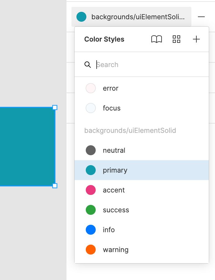
Preview of Figma using color use cases. Here you can see a similar naming lookup to what's used in code.
import {
  getColorScaleValueByUseCase,
  colorUseCases,
} from "@vitality-ds/system";

const { backgrounds } = colorUseCases;

const Component = styled("div", {
  backgroundColor: getColorScaleValueByUseCase(
    "primary",
    backgrounds.uiElementSolid
  ),
  "&:hover": {
    backgroundColor: getColorScaleValueByUseCase(
      "primary",
      backgrounds.uiElementSolid_hovered
    ),
  },
});
Every color consists of a scale and a use case:
- Scales - A group of "tints" of a specific color. For instance, the Primary scale has varying degrees of tints of cyan.
- Use cases - A mapping of a use case to an individual tint for any scale. For example, solid backgrounds use a high-saturation success (green) and light app backgrounds use a low-saturation. Border use cases use a light version of the color.
Mapping a use case to a scale value allows things like dark mode to work automatically; as color values mapped to use cases are inverted/switched depending on the color mode. Try it out:
The below example utilises a number of use cases to show example Appointments. These components utilise the use cases for subtle backgrounds, borders and UI element backgrounds – as well as active and hover states.
Consult
Procedure
Recall
Switch color mode for reference:
The below expands on the various use cases for color. What this illusrates is how to decide which use case should be used for styling a component. This should remove guess work and encourage consistency.
Use the below as reference. If you're using the copied tooltips below, you may need
to import the getColorScaleValueByUseCase function into your file:
Backgrounds
uiElement
uiElement_hovered
uiElement_active
uiElement_selected
uiElement_focused
uiElement_disabled
uiElementSolid
uiElementSolid_hovered
uiElementSolid_active
uiElementSolid_selected
uiElementSolid_focused
uiElementSolid_disabled
uiElementOnSurface
uiElementOnSurface_hovered
uiElementOnSurface_active
illustration_stroke
illustration_fill
blanket
app
card
sidebar
subtle
surface
tableRowAlternate
Borders
uiElement
uiElement_hovered
uiElement_active
uiElement_selected
uiElement_disabled
uiElement_focused
subtle
separator
focusRing
onSolidBackgrounds
Text
hiContrast
lowContrast
hiSaturation
disabled
placeholder
onSolidBackgrounds
hiContrastOnSolidBackgrounds
lowContrastOnSolidBackgrounds
The below snippet outlines the mappings between use cases and their scale numbers. Most of the time you won't need to know this.
The intention of having a defined set of use cases is to reduce the need for guess work when it comes to making visual design choices. This in turn helps create consistency in the design system.
Vitality provides two general pre-defined opinions about the visual design of a component:
- Standard/Subtle UI Elements (
uiElement) and - “Solid” UI Elements (
uiElementSolid).
Generally speaking, most UI elements should utilise the color use cases in the UI element world. This will ensure that strong, bold (or “solid”) color treatments are reserved for things that need to stand out.
Component Heading - Standard UI Element
Example uses a transparent background, utilising the backgrounds.app use
case. Pariatur eiusmod velit magna cillum elit excepteur sunt elit dolor.
Ea in mollit sit amet est commodo ipsum. Magna non et esse ipsum.
Component Heading - Standard UI Element
Example uses a filled background (step 3), utilising
backgrounds.uiElement. Pariatur eiusmod velit magna cillum elit
excepteur sunt elit dolor. Ea in mollit sit amet est commodo ipsum. Magna
non et esse ipsum.
The above examples show a few ways in which the UI Element style can be varied depending on your design choices. Sometimes a border may not be necessary, sometimes you may use the “app” background use case instead of the “uiElement” one, or different text use cases etc.
Designed to be visually distinct, the concept of a solid UI element is really about utilising colors that are more saturated - further up in the scale. Whilst UI Elements utilise high and low contrast text, the solid ones simply utilise the “on solid backgrounds” text use case.
Component Heading - Solid UI Element
Component Body. Pariatur eiusmod velit magna cillum elit excepteur sunt elit dolor. Ea in mollit sit amet est commodo ipsum. Magna non et esse ipsum.
Component Heading - Solid UI Element
Component Body. Pariatur eiusmod velit magna cillum elit excepteur sunt elit dolor. Ea in mollit sit amet est commodo ipsum. Magna non et esse ipsum.
Common use cases for a solid element might be a primary button, a checked checkbox or a selected date in a date picker.
Buttons are a useful example of seeing the difference too. Default buttons are “ui elements”, and primary buttons are “solid ui elements”
The examples below demonstrate solid UI element backgrounds with two text variants:
Variant Tester
Use this to test different color variants and styles.
For some components, you may want to use a color with a subtle transparency. This is done by using the the neutralA scale. All of the same use cases are available for this scale, but the values are different. The neutralA scale is a set of colors that are designed to be used on top of a background image or color.
The
neutralAscale is designed to be used in specific cases where you want to use a color with a semi-transparent background. As Vitality is not designed to be overly transparent, some components may behave differently when using this scale. For example, theButtoncomponent will not use theneutralAscale for its background color, but will use it for its border color.
() => {
  const TransparentContainer = styled(Flex, {
    backgroundColor: "$neutralA1",
    padding: "$xl",
    borderRadius: "$default",
  });

  return (
    <DocsBox
      css={{
        width: "100%",
        display: "flex",
        justifyContent: "center",
        alignItems: "flex-end",
        paddingBlock: "$xxl",
        backgroundImage:
          "url(https://media2.giphy.com/media/v1.Y2lkPTc5MGI3NjExd2k2NGR5YzNkZ21lNDIzcXNjM21kMzBkcmR2anI2M2cxeWpsbTczYiZlcD12MV9pbnRlcm5hbF9naWZfYnlfaWQmY3Q9Zw/2csuIJj6TmuKA/giphy.gif)",
      }}
    >
      <TransparentContainer spacing="lg">
        <FormField
          label="Email"
          inputProps={{ placeholder: "you@example.com" }}
        />
        <FormField type="password" label="Password" />
        <Button appearance="primary" shouldFitContainer>
          Login
        </Button>
      </TransparentContainer>
    </DocsBox>
  );
};
Vitality's complete color palette provides all the colors you should need. If you are choosing colors outside of this palette, please consult with your designer.
Whilst the use of one-off colors should be avoided, you can use these values in your styled() definitions of a component:
- Try not to use custom colors. Discuss with the designer in your team
() => {
  const MyComponent = styled("div", {
    backgroundColor: "hsl(10, 49%, 44%)",
    padding: "$xxl",
  });

  return <MyComponent>Custom color</MyComponent>;
};