
Forms
Allow users to enter data for use by the application, or to configure options.
Forms are made up of Input controls that enable users to either provide information or set preferences, related form elements are grouped. Forms can range from basic to complex, and may be displayed as standalone pages, supplementary panels, or dialog boxes, depending on the specific context and purpose.
In a healthcare context, forms play a crucial role in both recording and recalling important data.
Some examples of forms that may be utilised include:
- all users creating an account or logging in
- patients registering for a specific medical service
- doctors providing clinical information on a specific patient or searching for medications
- all users adjusting their settings, such as enabling notifications
- patients taking a survey or providing feedback
When creating forms, the goal is to gather information and guide users with minimal hassle. Things that can cause a hassle include overly complicated and time-consuming forms, collection of unnecessary information and poorly-organised form sections.
In order to allow users to quickly scan and complete the form, it's important to:
- Keep it simple: Design forms that are easy to understand and complete. Keep the number of fields to a minimum and use clear and concise language.
- Use proper labelling: Use descriptive labels for each field and ensure that they are easy to understand.
- Organise related tasks under section titles/subtitles to provide more context and make the interface easier to scan.
- Create a clear and intuitive user flow by following logical and predictable patterns, such as asking for the user's name before their postal address.
- Design forms with a conversational flow by asking specific and relevant questions first and then progressively revealing additional inputs as they become relevant.
- Minimise the need for users to switch between input methods, such as keyboard and mouse.
- Test thoroughly: Test the form thoroughly before launching it. This can include usability testing, accessibility testing, and security testing.
Password managers and web browsers that automatically populate data for users should be used with great caution. In a health care context, imagine that important health information or measurements were auto-completed by the browser based on recent entries; this could result in misleading values. Thus, autocomplete should be used with great care and only in context where it makes sense.
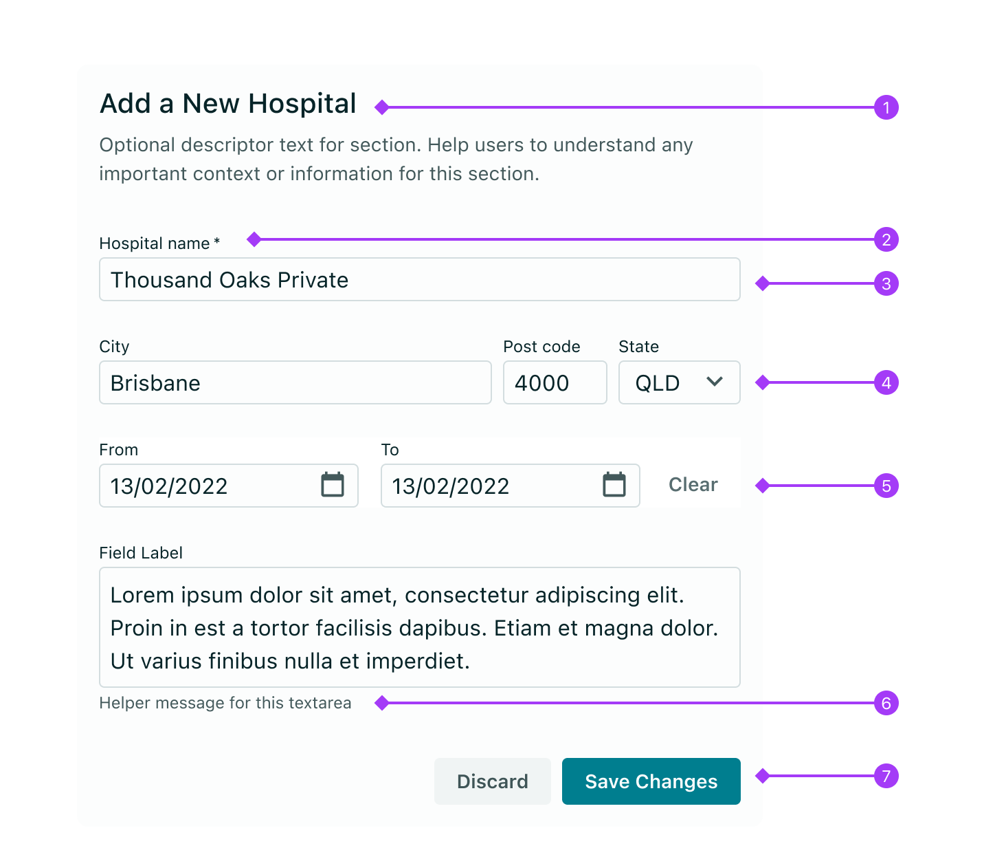
Forms are comprised of some or all of the following elements:
- Title: The title should describe the form. If the form is the main content on a page, use a
pageTitleTypography variant, otherwise use asectionTitlevariant and adjust the rest of the page hierarchy accordingly. A brief (1-2 sentence) description can follow the title to provide additional context around what the form's purpose is. - Labels: Input labels help users understand what the corresponding inputs mean.
- Text inputs: Enable users to input free-form text.
- Data Inputs: These include
Checkbox,RadioButtonsandSelect. - "Bound Entry" Controls: Another form of data input, bound entries request user data bound by certain constraints such as date/time and currency formats. Includes
DatePickers,TimePickersandCurrencyInput. - Helper messages: Communicate useful information on how to fill out a field. Helper text will become 'critical' (red) in colour if there is an error. Helper text is optional.
- Buttons: Allows users to submit, discard or perform various actions relating to a form.
A label helps the user to understand what information is being requested of them. Use labels to provide context to an input field describing the purpose of that field.
- Use verbs sparingly. Labels have inferred purpose and instruction - long-winded labels are not required and can cause visual clutter. For example, providing a text input with a label saying
"First name", has the same effect as having a label saying"Insert your first name here". - Do not put a colon (:) after the label for a field. The component's design already communicates the relationship between the label and the input field and adds unnecessary characters.
- Use sentence case for all label text with a capital letter for the first word and lowercase for subsequent words.
- Be succinct - labels are not helper text. Use one to three words only.
Below is an example of a helpful and a flawed label for a simple "First name" FormField.
<>
  <Stack>
    <FormField
      label="First name"
      type="text"
      inputProps={{ placeholder: "This has a good label" }}
    />
    <FormField
      label="Insert First Name Here:"
      type="text"
      inputProps={{ placeholder: "This has a bad label" }}
    />
  </Stack>
</>
Text inputs allow users to enter and edit free-form text. A typical use case is to get a single line of text within a form, for example a first name. For inputs that require users to enter and edit large amounts of text, such as comments, clinical notes, or other types of textual data, use Textarea.
() => {
  const [textInputValue, setTextInputValue] = React.useState("");
  const [passwordValue, setPasswordValue] = React.useState("");
  const [textareaValue, setTextareaValue] = React.useState("");

  return (
    <Stack align="stretch">
      <Stack direction="horizontal">
        <FormField
          label="Text input"
          type="text"
          id="text_input"
          value={textInputValue}
          onChange={(e) => setTextInputValue(e.target.value)}
        />
        <FormField
          label="Password input"
          type="password"
          id="password_input"
          value={passwordValue}
          onChange={(e) => setPasswordValue(e.target.value)}
        />
      </Stack>
      <FormField
        label="Textarea"
        type="textarea"
        id="textarea_input"
        value={textareaValue}
        onChange={(e) => setTextareaValue(e.target.value)}
        inputProps={{ resize: "vertical" }}
      />
    </Stack>
  );
};
The below table outlines the key use cases for each type of text input.
-
Text Input: Read more on the Text Input documentation page.
-
Password Input: Read more on the Password documentation page.
-
Textarea Input: Read more on the Textarea documentation page.
Data inputs allow users to provide input on forms by choosing from a set of pre-determined options or a limited range of values. Vitality offers various data input components that enable users to make a selection, each serving a specific purpose.
() => {
  const [checkboxValue, setCheckboxValue] = React.useState(["label1"]);
  const [radioValue, setRadioValue] = React.useState("label1");
  const [selectValue, setSelectValue] = React.useState("select1");

  return (
    <div style={{ width: "50%" }}>
      <Stack align="stretch">
        <FormField
          type="checkbox"
          label="Checkboxes"
          id="checkbox"
          value={checkboxValue}
          onChange={(checkedItems) => setCheckboxValue(checkedItems)}
          inputProps={{
            name: "checkbox",
            options: [
              {
                label: "Label one",
                value: "label1",
                id: "label1",
              },
              {
                label: "Label two",
                value: "label2",
                id: "label2",
              },
            ],
          }}
        />
        <FormField
          type="radioButtons"
          label="Radio Buttons"
          id="radio"
          value={radioValue}
          onChange={(newValue) => setRadioValue(newValue)}
          inputProps={{
            name: "radio",
            options: [
              {
                label: "Label one",
                value: "label1",
                id: "label1",
              },
              {
                label: "Label two",
                value: "label2",
                id: "label2",
              },
            ],
          }}
        />
        <FormField
          type="select"
          label="Select"
          id="select"
          value={selectValue}
          onChange={(value) => setSelectValue(value)}
          inputProps={{
            name: "select",
            options: [
              { label: "Select one", value: "select1" },
              { label: "Select two", value: "select2" },
            ],
          }}
        />
      </Stack>
    </div>
  );
};
The below table outlines the key use cases for each selection control.
- Used to input set values, where more than one item can be selected (or none selected).
- Aim to arrange the Checkbox items vertically for easier scanning.
- For "no choice" options, the user can either leave no checkboxes selected, or you can present them with an explicit "None" option to indicate the field has been purposely left unanswered.
- Read more on the Checkbox documentation page.
() => {
  const [checkboxValue, setCheckboxValue] = React.useState(["label1"]);

  return (
    <FormField
      type="checkbox"
      label="Checkboxes"
      id="checkbox"
      value={checkboxValue}
      onChange={(checkedItems) => setCheckboxValue(checkedItems)}
      inputProps={{
        name: "checkbox",
        options: [
          {
            label: "Label one",
            value: "label1",
            id: "label1",
          },
          {
            label: "Label two",
            value: "label2",
            id: "label2",
          },
        ],
      }}
    />
  );
};
- A type of selectable input that allows users to communicate exactly one item from a list of options.
- Will always appear as part of a group of Radio Buttons with mutually-exclusive options. For example morning, afternoon, evening or night. As such, when one item is selected, all other items are de-selected.
- When it is valid for a user to have a "no choice" option, include an option labeled "None", or appropriate label given the context.
- Aim to arrange items vertically for easier scanning.
- Read more on the Radio Buttons documentation page.
() => {
  const [radioValue, setRadioValue] = React.useState("label1");

  return (
    <FormField
      type="radioButtons"
      label="Radio Buttons"
      id="radio"
      value={radioValue}
      onChange={(newValue) => setRadioValue(newValue)}
      inputProps={{
        name: "radio",
        options: [
          {
            label: "Label one",
            value: "label1",
            id: "label1",
          },
          {
            label: "Label two",
            value: "label2",
            id: "label2",
          },
        ],
      }}
    />
  );
};
- When you have more than five options for the user to choose from, use a Select, not a Checkbox or a Radio Buttons. Multi select can be enabled on Select.
- A single Select returns one option, similar to Radio Buttons
- A multi enabled Select returns multiple options, similar to a list of Checkboxes
- Read more on the Select documentation page.
() => {
  const [selectValue, setSelectValue] = React.useState("select1");

  return (
    <div style={{ width: "50%" }}>
      <FormField
        type="select"
        label="Select"
        id="select"
        value={selectValue}
        onChange={(value) => setSelectValue(value)}
        inputProps={{
          name: "select",
          options: [
            { label: "Select one", value: "select1" },
            { label: "Select two", value: "select2" },
          ],
        }}
      />
    </div>
  );
};
Bound entries allow users to input data, like dates and times or "masked" inputs such as health fund numbers or credit card details. They restrict user input and rely equally on keyboard and mouse interactions. They only allow valid entries, so field validation isn't usually needed. While these inputs assist with the validation process by providing restrictions or assistance to the selection of a value, the requirement for validation still exists and should be used.
() => {
  const [durationValue, setDurationValue] = React.useState("");
  const [currencyValue, setCurrencyValue] = React.useState("");
  const [timePickerValue, setTimePickerValue] = React.useState("");
  const [datePickerValue, setDatePickerValue] = React.useState("");
  const [maskedTextInputValue, setMaskedTextInputValue] = React.useState("");
  const [dateRange, setDateRange] = React.useState([]);

  return (
    <DocsBox style={{ width: "100%" }}>
      <Stack>
        <DocsBox style={{ width: "100%" }}>
          <Stack direction="horizontal">
            <DocsBox style={{ width: "34%" }}>
              <FormField
                type="duration"
                label="Duration"
                id="duration"
                onChange={(event) => setDurationValue(event.target.value)}
                value={durationValue}
                inputProps={{ maxLength: 4 }}
              />
            </DocsBox>
            <DocsBox style={{ width: "33%" }}>
              <FormField
                type="currency"
                label="Currency"
                id="currency"
                value={currencyValue}
                onChange={(e) => setCurrencyValue(e.target.value)}
                inputProps={{
                  name: "currency",
                }}
              />
            </DocsBox>
            <DocsBox style={{ width: "33%" }}>
              <FormField
                type="timePicker"
                label="Time Picker"
                id="time_picker"
                value={timePickerValue}
                onChange={(e) => setTimePickerValue(e.target.value)}
                inputProps={{
                  name: "time_picker",
                }}
              />
            </DocsBox>
          </Stack>
        </DocsBox>
        <DocsBox style={{ width: "100%" }}>
          <Stack direction="horizontal">
            <DocsBox style={{ width: "50%" }}>
              <FormField
                type="datePicker"
                label="Date picker"
                id="date_picker"
                onChange={(value) => setDatePickerValue(value)}
                value={datePickerValue}
                inputProps={{
                  name: "date_picker",
                }}
              />
            </DocsBox>
            <DocsBox style={{ width: "50%" }}>
              <FormField
                label="Masked text input"
                type="text"
                helperMessage="This is the medicare mask"
                id="text_input"
                value={maskedTextInputValue}
                onChange={(e) => setMaskedTextInputValue(e.target.value)}
                inputProps={{
                  maskProps: {
                    guide: true,
                    presetMask: "medicare",
                  },
                }}
              />
            </DocsBox>
          </Stack>
        </DocsBox>
        <DocsBox style={{ width: "100%" }}>
          <FormField
            type="dateRangePicker"
            label="Date range picker"
            id="date_range_picker"
            onChange={(value) => setDateRange(value)}
            value={dateRange}
            inputProps={{
              name: "date_range_picker",
            }}
          />
        </DocsBox>
      </Stack>
    </DocsBox>
  );
};
The below table outlines the key use cases for each of the "bound entry" inputs.
For more information see Duration Input docs
() => {
  const [durationValue, setDurationValue] = React.useState("");

  return (
    <DocsBox style={{ width: "50%" }}>
      <FormField
        type="duration"
        label="Duration"
        id="duration"
        onChange={(event) => setDurationValue(event.target.value)}
        value={durationValue}
        inputProps={{ maxLength: 4 }}
      />
    </DocsBox>
  );
};
For more information see Currency Input docs
() => {
  const [currencyValue, setCurrencyValue] = React.useState("");

  return (
    <DocsBox style={{ width: "50%" }}>
      <FormField
        type="currency"
        label="Currency Input"
        id="currency"
        value={currencyValue}
        onChange={(e) => setCurrencyValue(e.target.value)}
        inputProps={{
          name: "currency",
        }}
      />
    </DocsBox>
  );
};
For more information see Time Picker docs
() => {
  const [timePickerValue, setTimePickerValue] = React.useState("");

  return (
    <DocsBox style={{ width: "50%" }}>
      <FormField
        type="timePicker"
        label="Time Picker"
        id="time_picker"
        value={timePickerValue}
        onChange={(e) => setTimePickerValue(e.target.value)}
        inputProps={{
          name: "time_picker",
        }}
      />
    </DocsBox>
  );
};
For more information see Date picker docs or Date range picker docs
() => {
  const [datePickerValue, setDatePickerValue] = React.useState("");
  const [dateRange, setDateRange] = React.useState([]);

  return (
    <Stack>
      <DocsBox style={{ width: "50%" }}>
        <FormField
          type="datePicker"
          label="Date Picker"
          id="date_picker"
          onChange={(value) => setDatePickerValue(value)}
          value={datePickerValue}
          inputProps={{
            name: "date_picker",
          }}
        />
      </DocsBox>
      <DocsBox style={{ width: "100%" }}>
        <FormField
          type="dateRangePicker"
          label="Date range picker"
          id="date_range_picker"
          onChange={(value) => setDateRange(value)}
          value={dateRange}
          inputProps={{
            name: "date_range_picker",
          }}
        />
      </DocsBox>
    </Stack>
  );
};
For more information see MaskProps section of the Text input docs
() => {
  const [maskedTextInputValue, setMaskedTextInputValue] = React.useState("");

  return (
    <DocsBox style={{ width: "50%" }}>
      <FormField
        label="Masked Text Input"
        type="text"
        helperMessage="This is the medicare mask"
        id="text_input"
        value={maskedTextInputValue}
        onChange={(e) => setMaskedTextInputValue(e.target.value)}
        inputProps={{
          maskProps: {
            guide: true,
            presetMask: "medicare",
          },
        }}
      />
    </DocsBox>
  );
};
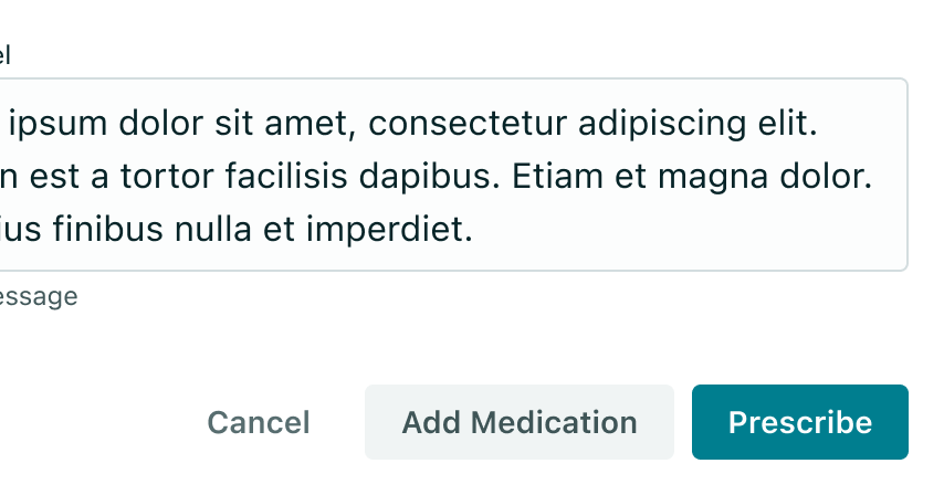
Use a primary Button for the main action, a "default" Button for secondary actions like cancel or discard.
For cases where additional secondary actions can be performed, use the ghost appearance and place the secondary Button in between the cancel and primary Buttons.
When using multiple Buttons, the primary button should be positioned on the right and all other Buttons to the left of the primary Button. Although research indicates that the performance differences between the placement of "other" and primary Buttons are minimal, maintaining consistency across a product is important. Therefore, it is our established guideline to have other Buttons to the left and the primary Button to the right - and this should always be adhered to.
- Buttons are always right-aligned within a form layout
- The primary action is always in the right-most position

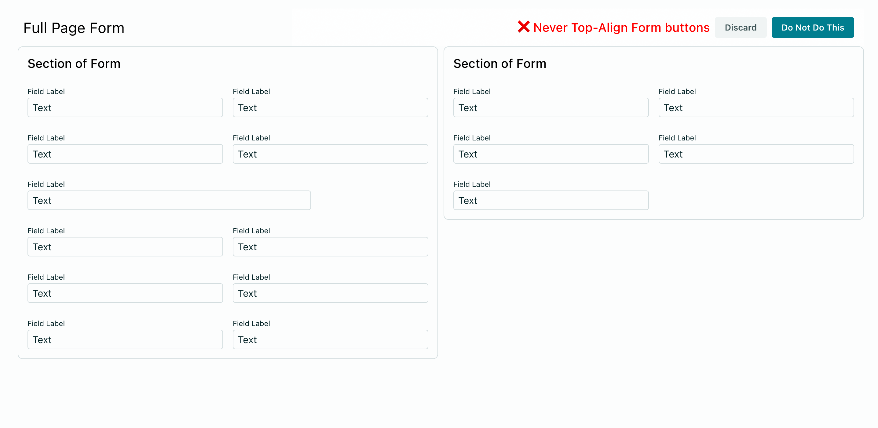
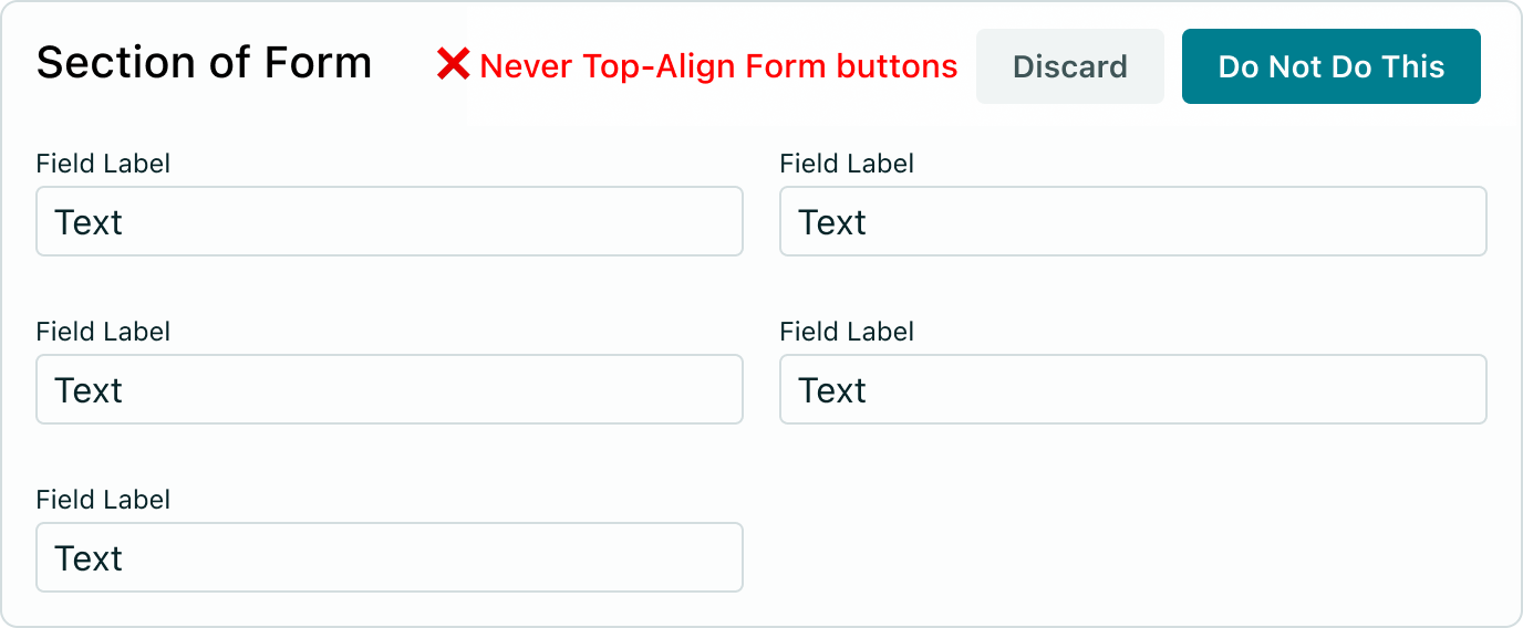
Full-page forms
- On full-page forms, actions are "docked" to the bottom right of the view port.
- The "tray" they appear in displays a semi-transparent blur effect over its content, so if the user scrolls you will see it underneath.
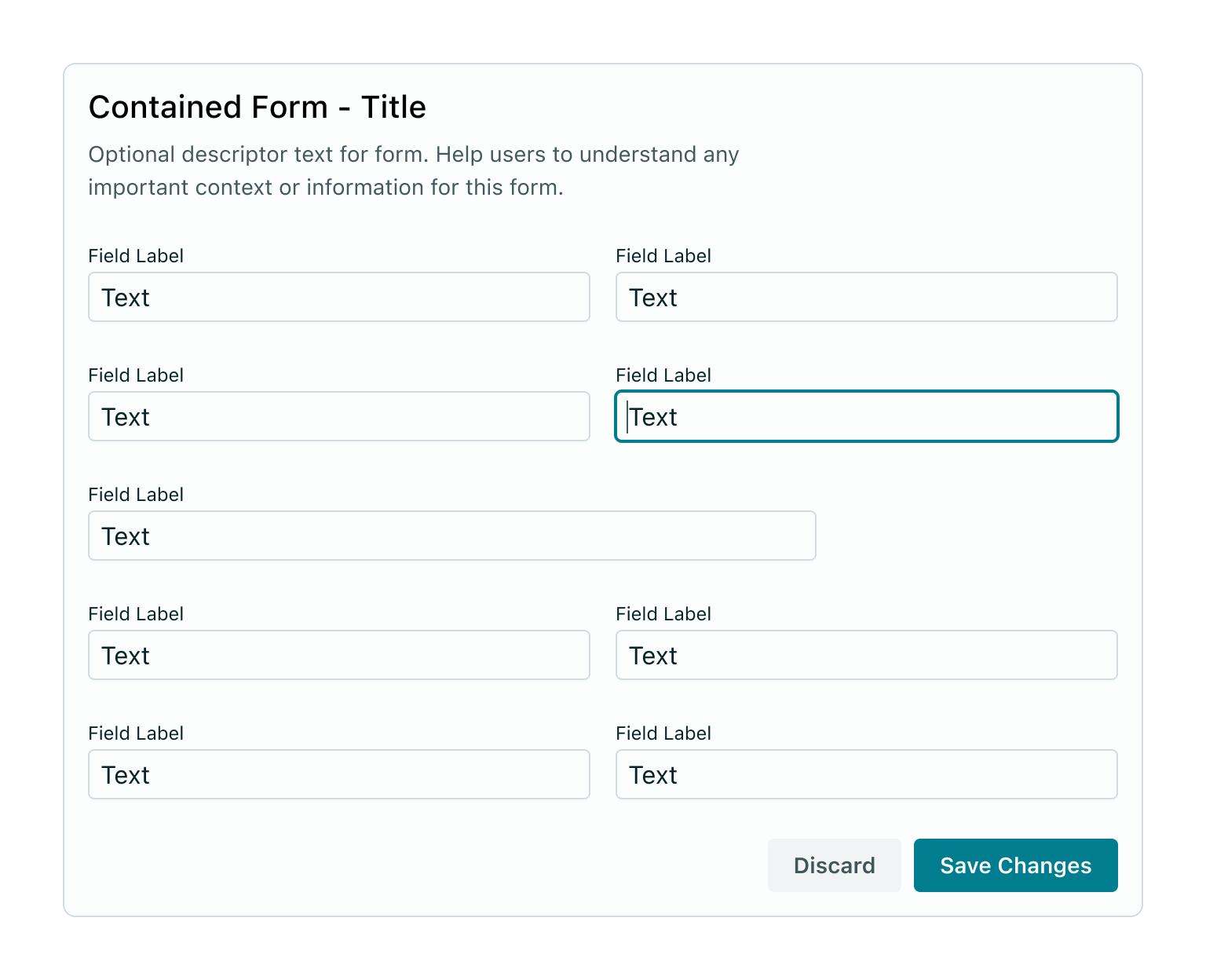
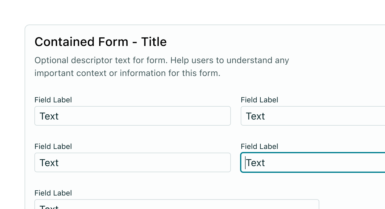
Contained forms
When you add buttons to a smaller container, position them at the bottom. This includes Modal Dialogs - see below.
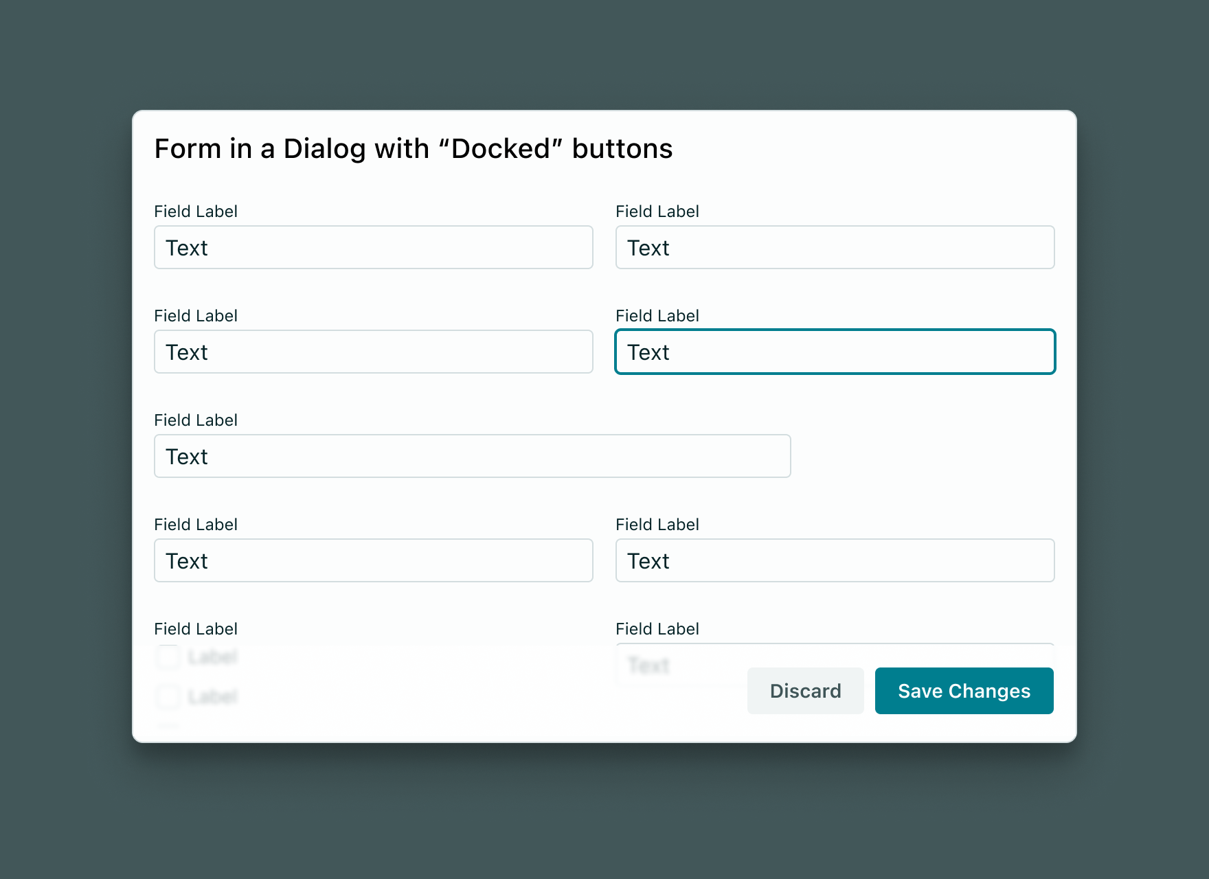
Modal Dialog forms
- In a
ModalDialogwhere the height is capped (causing internal scrolling for any overflow), the same docking behaviour happens on Buttons but without the blur (theModalDialogcreates an internal shadow instead). - In
ModalDialog's where the form content does not overflow, the rules for standard positioning of modal buttons applies (bottom right)
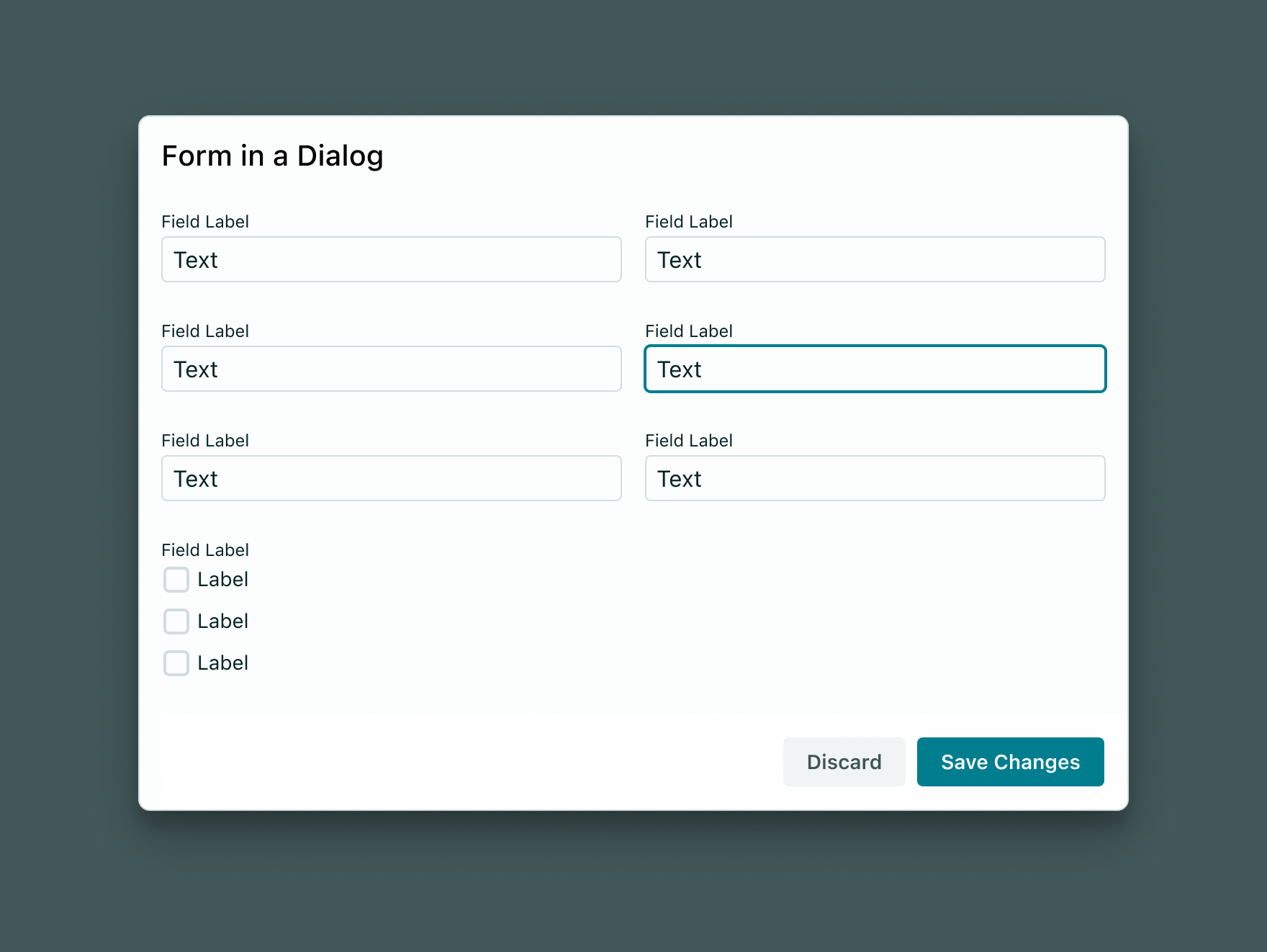
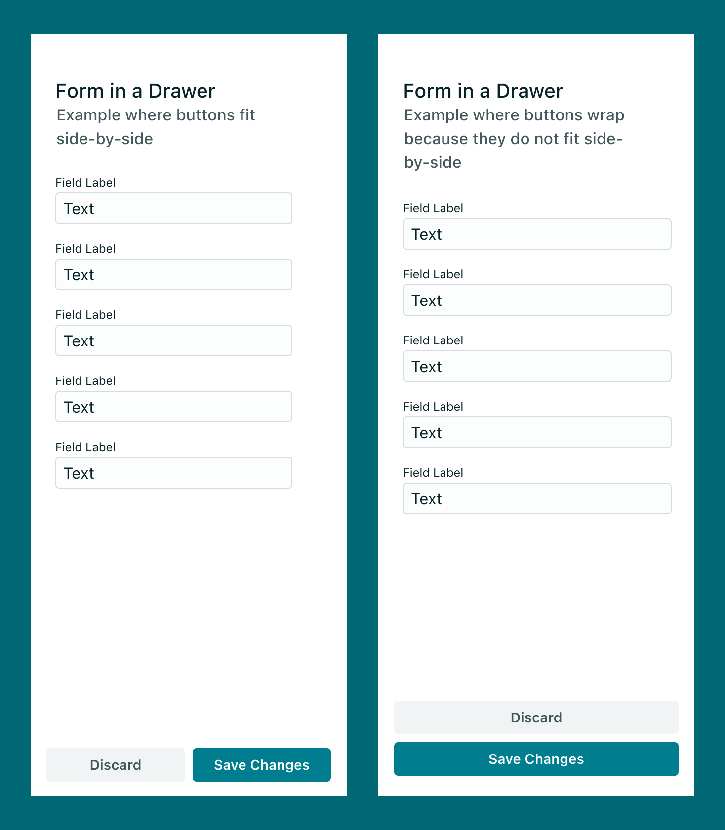
Forms in drawers / mobile devices
- On small drawers and mobile view, if buttons can still fit on one line, they will expand to fill the entire width to avoid leaving a small amount of white space to the left.
- If they do not fit, they become full width and stack on top of one another, with the primary button appearing at the bottom most position.
When you are laying out a form, place the buttons at the bottom. We believe this is the best design because it encourages designers to:
- Only ask for essential input
- Write concise form copy
- Only ask for essential information
- Lay the form out so the user can complete it correctly start-to-finish.
Furthermore, placing buttons in a consistent location will help users to know where to locate them in any form.
This does not mean buttons can never appear at the top of a screen/component – this guidance is strictly for form layout design.
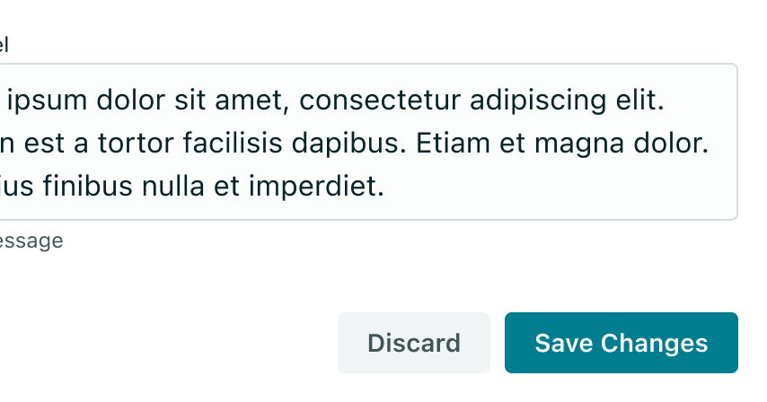
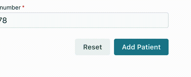
Aim to clarify the exact action the button will perform for the user - such as "Add Patient", "Save Changes" or "Prescribe". Generic terms such as "Submit" fail to accurately reflect the specific purpose of the form and give the user an unclear understanding of what the action will do. Abstract phrases such as "Submit" create a generic perception of the form for the user.
<Stack direction="horizontal">
  <Button appearance="ghost">Discard</Button>
  <Button>Add Medication</Button>
  <Button appearance="primary">Prescribe</Button>
</Stack>
- Task-specific language in your buttons that is short and concise
- Use verbs to describe the action
- Using generic or vague language to describe an action.
Avoid using icons in form action buttons - the text value should be enough.
- Icons can add visual noise and are usually used to support ambiguous actions in user interfaces. In a form context, the actions performed should be fairly straightforward and thus do not require iconography to help (ie. save, discard etc).
- Refer to the Button documentation for more information
<Stack>
  <Stack direction="horizontal">
    <Button>Discard</Button>
    <Button appearance="primary" iconLeft={<ClaimPending />}>
      Save Changes
    </Button>
  </Stack>
  <Stack direction="horizontal">
    <Button>Discard</Button>
    <Button appearance="primary">Save Changes</Button>
  </Stack>
  <Typography variant="caption">Icons in action cause clutter</Typography>
</Stack>
Use helper messages to communicate essential information to the user about a form field. In some fields, the content can provide additional context around what kind of data the field expects - and in other cases it can be used to hint at the format of data required. Helper messages are the ideal choice for information that is essential to know.
For additional context or background information that is desirable but not essential, use either placeholder text or a tooltip.
() => {
  const [hpio, setHpio] = React.useState("");
  const isValid = hpio.trim().length < 9;

  return (
    <FormField
      type="text"
      label="HPI-O number"
      id="hpio"
      value={hpio}
      onChange={(e) => setHpio(e.target.value)}
      helperMessage="HPI-O is 8 characters long."
      inputProps={{
        name: "hpio",
        "aria-invalid": !isValid,
      }}
      hasError={!isValid}
    />
  );
};
When a FormField is invalid, the helper message will have red 'critical' colouring to indicate something is wrong - and the message should provide useful information on how to make the field's contents valid.
() => {
  return (
    <FormField
      type="text"
      label="Error HPI-O number"
      id="errorHpio"
      value={undefined}
      onChange={() => {}}
      helperMessage="HPI-O must be 8 characters long."
      inputProps={{
        name: "hpio",
        "aria-invalid": false,
      }}
      hasError
    />
  );
};
- Communicate crucial information that is considered secondary to the input label.
- Keeping helper messages as short and specific as possible.
- Overloading the user - only use helper messages when really necessary
- Using helper text in place of field labels.
- Messages that run longer than the input area.
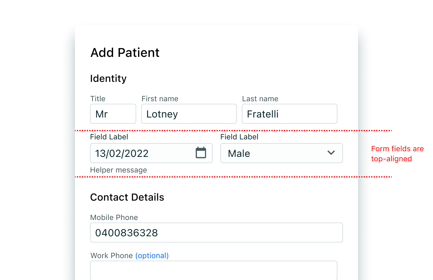
Aligning FormFields that contain helper messages
When fields appear side-by-side and one input has helper text while the other one doesn't; always top align the form fields so that their labels are aligned.
Placeholder text hints at the type of data that should be entered into a field, including its formatting. It should not contain crucial information. When the requested input may be unfamiliar to the user or formatting is in question, use placeholder text.
While placeholders can help, they can also hinder. You should heavily consider how placeholder text is used in the context of your form. Consider helper messages rather than a placeholder for providing additional context.
<FormField
  type="text"
  value={null}
  label="Case ID"
  onChange={() => null}
  id="cid"
  inputProps={{ placeholder: "e.g. CID-23434", name: "cid" }}
/>
- Keeping hints as short as possible and never overrun the input field
- Properly anonymising examples rather than using real values. (eg. Jane Citizen, you@example.com)
- Using placeholder text to convey complex or lengthy information such as password requirements - Instead, use an informational tooltip
- Providing placeholder text when it isn't necessary
- Using placeholder text as a replacement for field labels
Tooltips can be very useful for providing additional explanation to users that may be unfamiliar with a particular form field. They can also offer rationale for what may seem like an unusual request. However, research suggests that users should not have to dig around for a tooltip to access information that's essential for the completion of their task.
Tooltips only appear on hover (desktop).
() => {
  const [hpio, setHpio] = React.useState("");
  const isValid = hpio.trim().length < 9;

  return (
    <FormField
      type="text"
      label="HPI-O number"
      id="hpio"
      value={hpio}
      infoTooltipContent="HPI-O is a number for matching records to patients. The Healthcare Identifiers Service uses it to identify people, providers, and organizations."
      onChange={(e) => setHpio(e.target.value)}
      helperMessage="HPI-O is 8 characters long."
      inputProps={{
        name: "hpio",
        "aria-invalid": !isValid,
      }}
      hasError={!isValid}
    />
  );
};
- Use tooltips with the outlined 'i' (info) icon
- Use tooltips for explanatory or added information
- Tooltips are micro content; keep them concise
- Tooltips are not catchalls for content that doesn't fit elsewhere; they must be used intentionally and very sparingly
- Never house essential information in a tooltip.
Sometimes setting sensible default values on input fields can be useful - for example, pre-filling a user's current country location based on their browser's reported location. However, in a health care context where a lot of data is carefully input by a medical professional, pre-filling content can be misleading and may even lead to clinical safety risks. Although this is unlikely, Vitality recommends that you follow the below rules when deciding when to set default values:
- Should this data be verified by a medical professional before setting it?
- Could there be potential harm in assuming this value to be a correct default?
It's often better to err on the side of caution with pre-filling any information, however there can be cases where it is trivial and more useful.
Error messages let users know that a hurdle was encountered and give solutions to fix them - they are an indicator of the system's status. But in order for the error messages to be effective, people need to see them, understand them, and be able to act upon them easily. "Visibility of system status" is one of Jakob Nielsen's 10 usability heuristics.
The below principles should be followed:
- An error message should be easy to notice and understand.
- Field(s) in error should be easy to locate.
- Users shouldn't have to memorize the instructions for fixing the error.
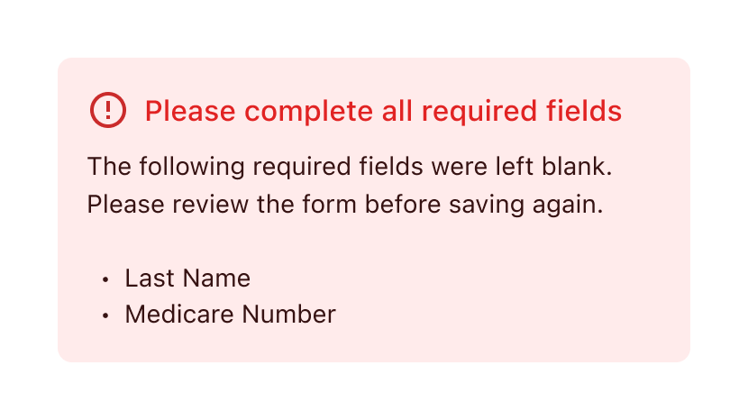
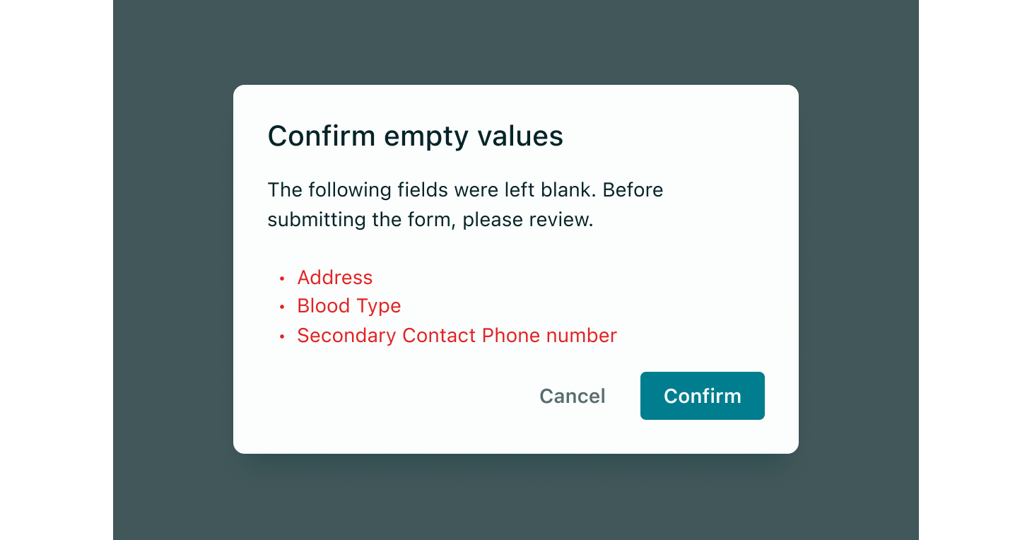
A validation summary is shown at the top of the form (after server-side validation, see below) and lets users know that there are errors that need to be fixed on the page, whether those errors are in the viewport or below the fold.
With those principles, Vitality suggests the following:
-
Use inline validation whenever possible - via helper messages and the
hasErrorprop to indicate an error state
Example validation summary -
Use Modals or Confirmation Dialogs Sparingly
Modal or confirmation dialogs can be used to highlight potential errors and provide clarification to help the user correct them. However, it's important to use these dialogs sparingly due to two main drawbacks: (1) they can be intrusive, and (2) the error message appears in a separate window that must be closed before the error can be fixed, potentially putting extra strain on users' memory. These dialogs are acceptable for straightforward error messages or forms that can still be submitted despite the error.
-
Don't validate fields before input is complete
It is recommended to hold off on displaying errors until the user has completed the current field and moved on to the next. Interrupting the user with error messages before they have finished typing can be frustrating. Technically, favour the onBlur event to perform validation and present any errors on a field.
- Don't use validation summaries as the only indication of an error
A validation summary can give the user a global understanding of all the errors in a form, but shouldn't be used as the only form of error indication, as it forces the user to search for the field in error; moreover, the error message may no longer be present in the viewport when the user reaches the error field, thus forcing the user to memorise the error message while fixing the issue.
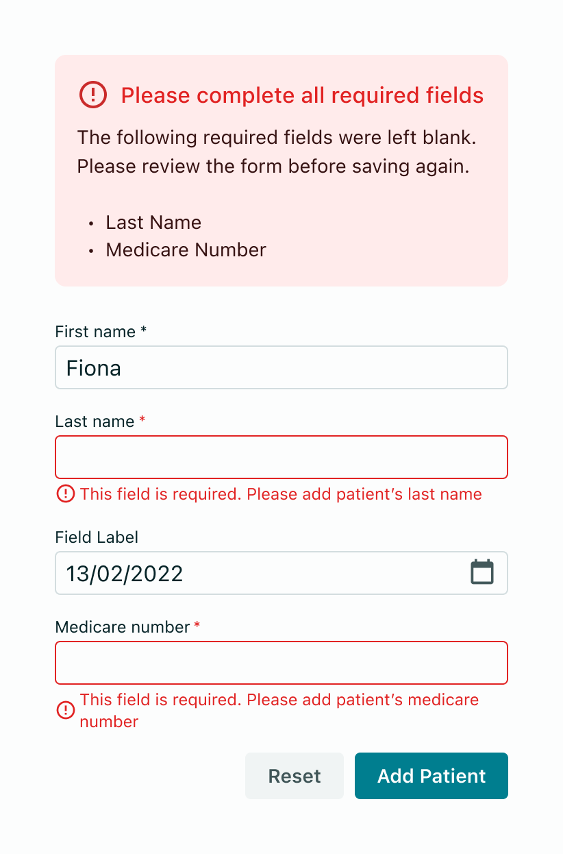
It is advisable to verify the user's input in real-time before form submission through inline validation (also known as client-side validation). This process should take place immediately when the field loses focus (onBlur event), facilitating quick detection and correction of errors.
The validation message below the field should be as descriptive as possible.
- Incorrectly formatting data
- Leaving a required field blank
- Leaving a required field incomplete
Validation summaries come into play when server-side errors are involved, i.e. the user tries to submit a form in its entirety and the page is reloaded with the detected errors. In these situations, use a validation summary as well as inline error messaging wherever possible to help users make the fix.
Inline error messages should disappear when the form criteria is met.
Try to avoid disabling buttons in a form - except for while it is submitting.
As studies show, the management of the "rules" that dictate if a button should be disabled can quickly become unwieldy, and can confuse the user as they may not understand the reasoning behind why the button is disabled. In a form context, there should be adequate client-side validation to guide the user in successfully completing a form and thus, the action button's disabled/enabled state is not necessary.
An action button can (and should) perform client-side validation and the form should then provide any error messaging that prevent the data from being submitted. Once the state of the form is valid, clicking the button will proceed with submitting to the server.
The good use case for disabling buttons is when an action can clearly not be performed - for instance if a medication is "Out of Stock", then an "Add Medication" button would not be enabled. Forms are more complex and thus avoid this pattern.
To prevent duplicate submissions, when a user submits a form, you should change the action button's state to isLoading which will show a loading spinner and disable it. Any other adjacent buttons should become disabled if their action would interrupt the form submission.
Aside from using the isLoading state of a form's submit button, use the following guidelines:
For smaller forms, set each FormField to disabled whilst in the loading state - and re-enable them if any errors require changes to the form.
For larger or full-page forms, utilise a "loading mask" which will cover the entire form and provide a spinner.
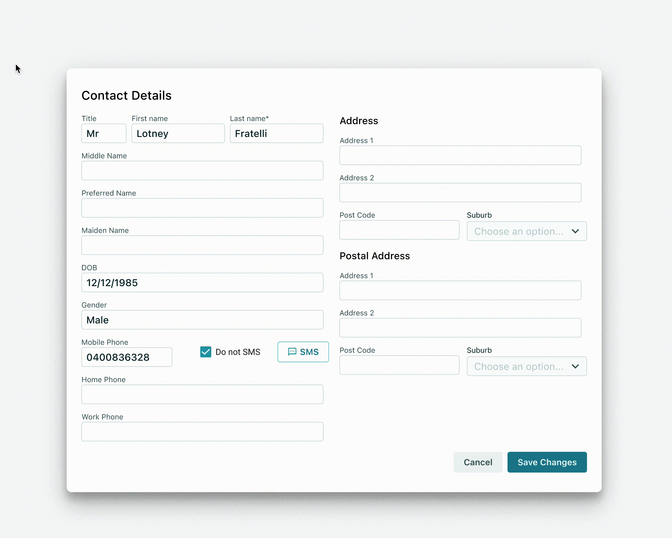
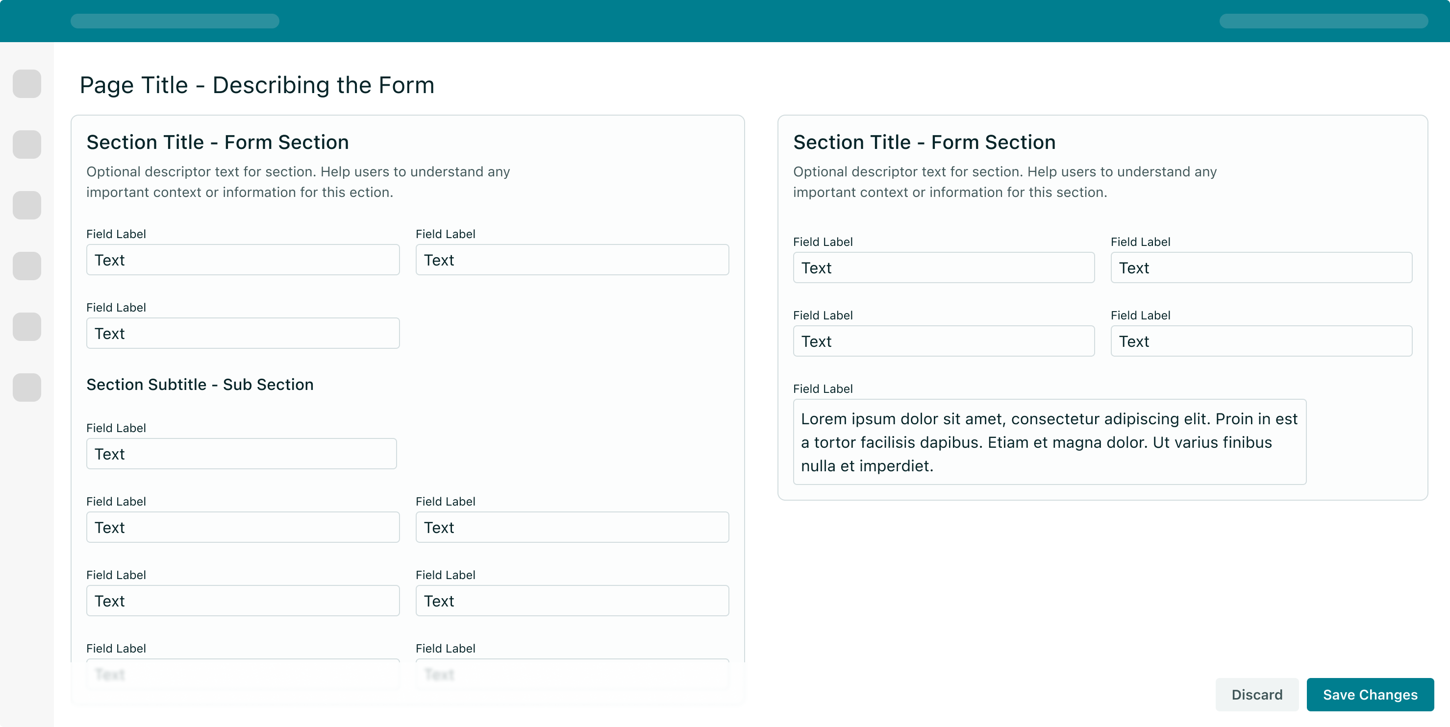
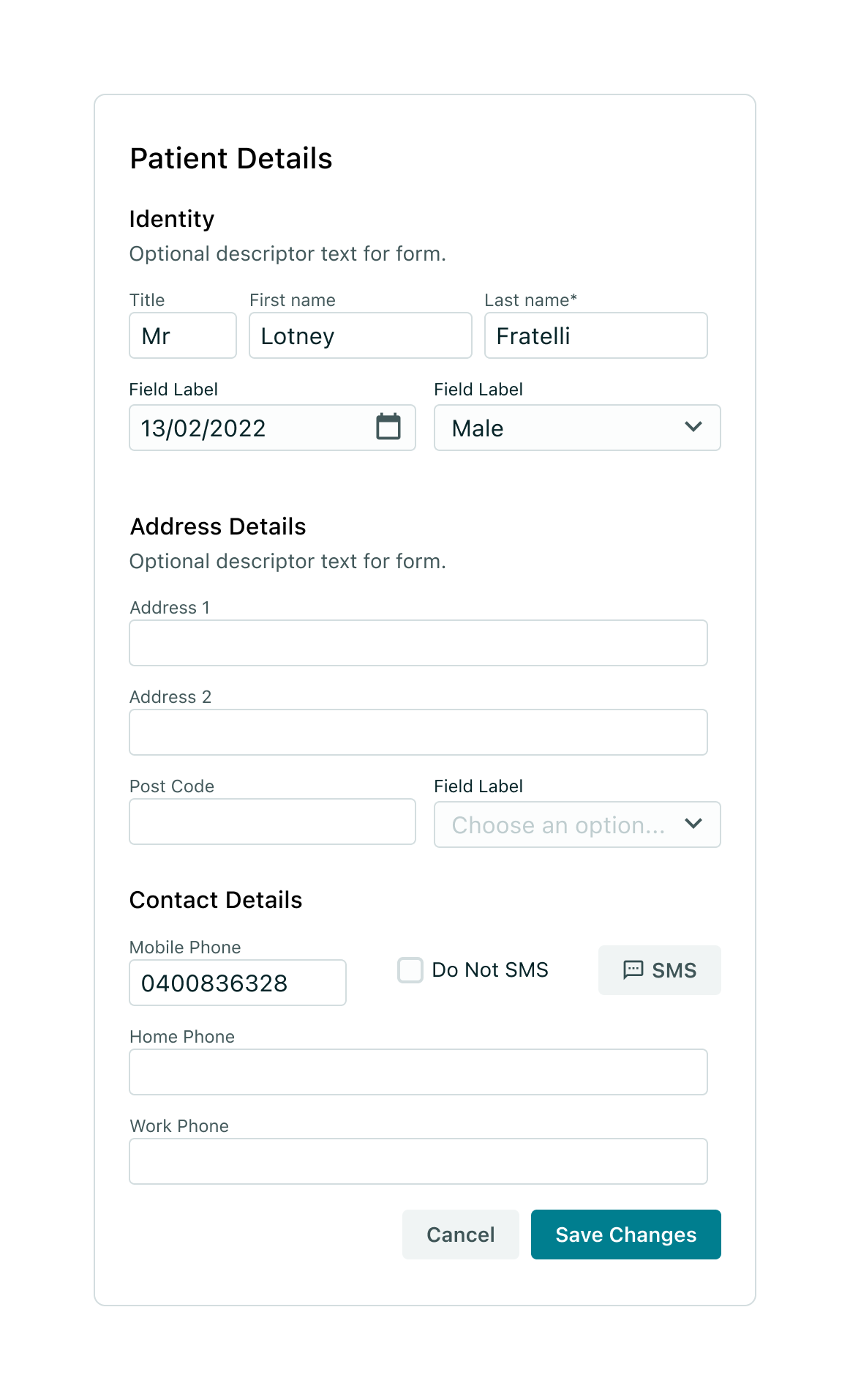
When designing or coding using Vitality, most forms can be composed of <FormField /> components, which takes care of the label, input field and helper text.
To allow for flexibility, Vitality does not dictate the layout of a form, however there are a few key guidelines to follow:
- Aim for single-column layouts to aid in readability
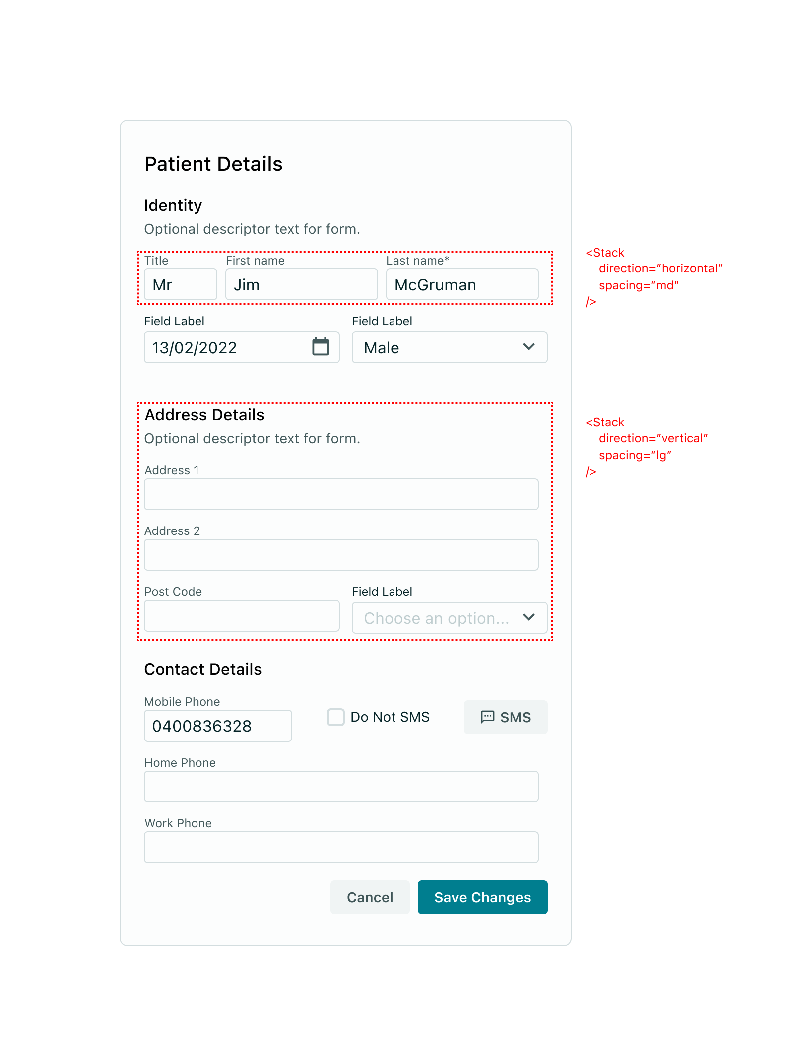
- Separate FormFields using the
<Stack />component - taking advantage of thehorizontalprop direction when necessary - Use nested Stack components when necessary to add columns inside rows/columns
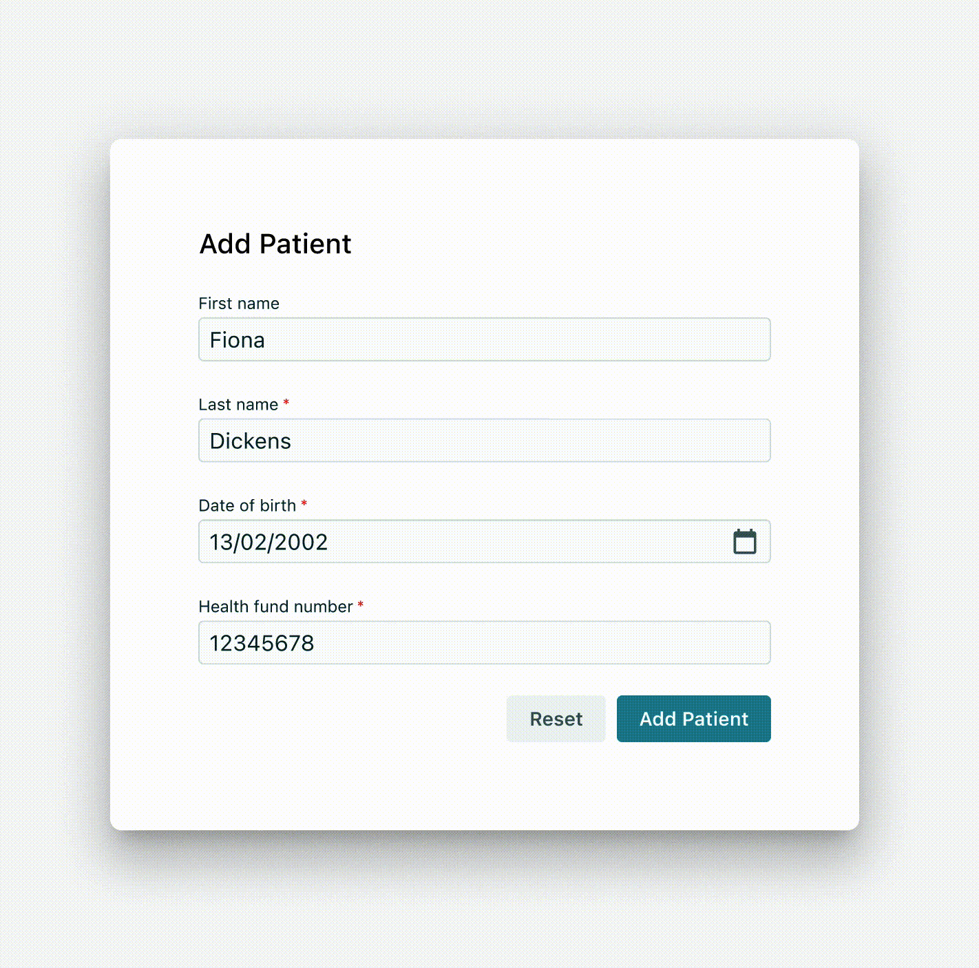
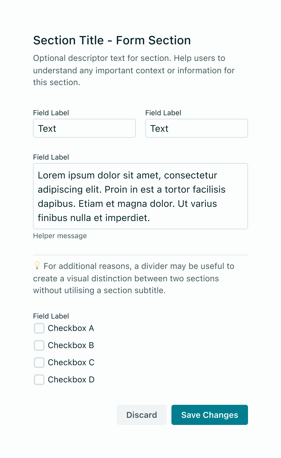
Headings describe the form. The heading should be the largest type size in the context of where the form is used. For instance, if the entire purpose of a page is to complete a form, use a pageTitle variant so that the page's title summarises the form. When the form is within a container or a dialog, it will use a sectionTitle. The title can also be followed by a short descriptor.
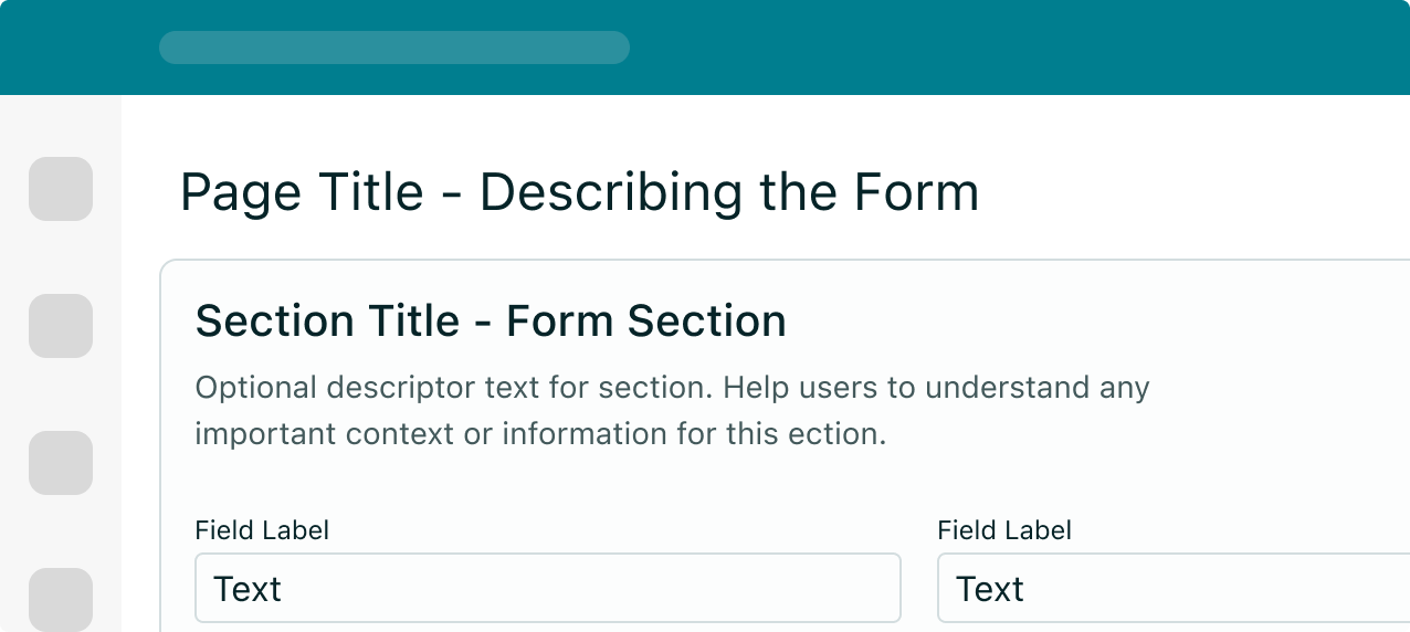
Group headings categorise the controls and fields within a form and their size should be adjusted according to context and form heading size (with larger font than field labels and smaller than form heading).
- Grouping inputs aids in a clear understanding of user requirements.
- Keep the group heading concise and, if necessary, add a brief explanation.
Users will be confused if inputs are too close together. To ensure sufficient spacing between single form elements as well as groups of inputs, use the <Stack /> component to configure elements.
As a rule of thumb, follow the below guidelines for spacing:
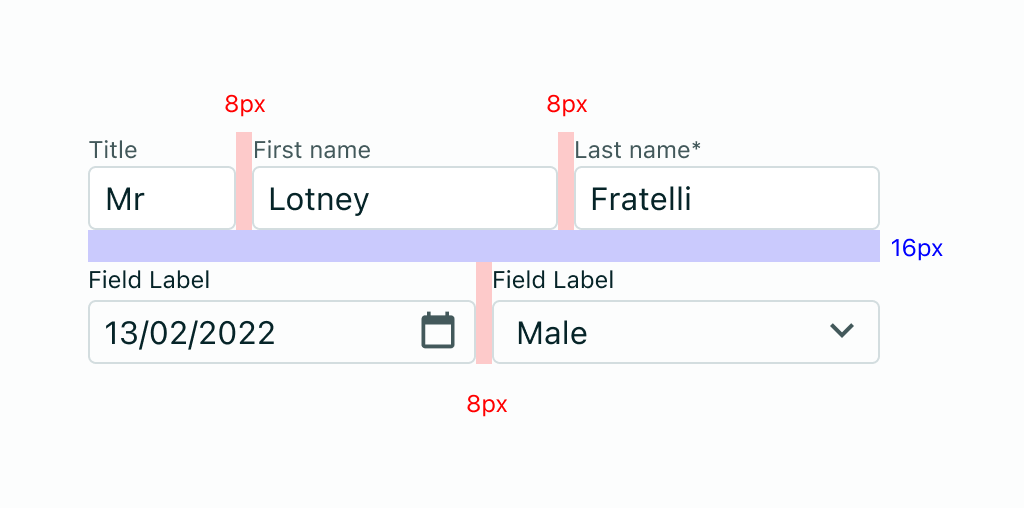
- Horizontal gaps between inputs use the md spacing (8px)
- Vertical gaps between rows of inputs use the lg spacing (16px)
- A field's width should generally reflect the intended length of content - but take into consideration its alignment to surrounding fields. Avoid over-sized input fields.
- Ensure that users can enter information on smaller screens.
- If an input's value is too long to fit in the required space, truncate its text or consider the Textarea component for multi-line text.
- The first required field in the form should receive focus when presented to the user.
Note below how counterintuitive it feels to have a large space to input just four digits. This input would be optimised if the width was reduced to reflect the expected data.
<DocsBox css={{ width: "100%" }}>
  <FormField
    type="text"
    label="Postcode"
    value={null}
    inputProps={{ maskProps: { presetMask: "ausPostCode" } }}
  />
</DocsBox>
Forms can be presented as standalone pages or within dialogs, containers, or drawers. The form's location affects its layout and vertical spacing. Typically, standalone page forms can accommodate more complexity. Refer to the form variants (below) for further guidance.
Forms used on standalone pages should utilise the overall page space available - taking care to define responsive behaviour to ensure the form's layout works optimally on all device sizes. Vitality's <Stack /> component allows you to set responsive values on how each stack should behave at each breakpoint.
When using forms in dialogs and drawers, forms should generally follow a single (or maximum, two) column layout where possible. If a form's context requires many fields to be used, you can either consider breaking it up into stages (see below "Designing for longer forms"), or to reduce the spacing used in the stack components.
When defining reduced spacing in form layouts, it is crucial that you maintain a consistent spacing
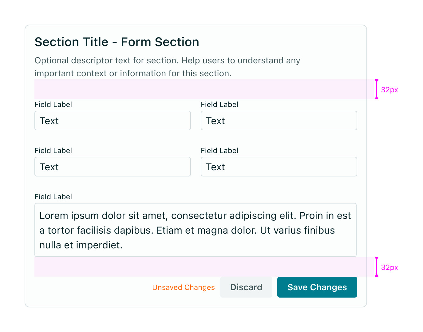
Regardless of location, individual input fields have a default height of 32px. For standalone page forms, which may have more space to work with, a 24px (xl) vertical space between fields is recommended. In contained forms such as side panels or modals, designers can opt for a 16px (lg) or 8px (md) spacing between inputs.
Although many design best-practices suggest taking a minimalist approach to form presentation, in a medical software context, one must find a balance between open space, simplicity and clarity. Many medical professionals come from a world where an entire screen is a form, which does offer many benefits in utility, but can have an adverse impact on clarity of task.
There is no one-size-fits-all answer. The user's intentions, along with the context of a product will determine the solution what works best.
Consider the below techniques to help make longer forms less overwhelming:
-
Progressive disclosure - reveal any additional content that may arise based on the user's previous selection.
-
Accordion Forms - allow users to dynamically expose and hide sections of related information
-
Multi-step (or "wizard") forms - A multistep form spreads form fields across multiple screens and incorporates a progress indicator (vertical or horizontal) to track a user's status step by step.
As of now, Vitality does not offer any components to achieve these patterns, but will explore in future iterations
Vertical spacing between form sections also depends on whether the form is a dedicated page or a container. Spacing between groups should be adjusted in relationship to spacing between individual items. For instance, if vertical spacing between individual inputs is 16px consider a 24px spacer before the first input and between sections. If the former number is 24px, consider 32px for the latter.
As a general rule, we recommend a 32px (xxl) spacer between the last input and the button or button group. Again, this will vary in mobile and in certain contained forms.
Whilst there are no official guidelines for using dividers in form content, Designers may choose to use it as a visual aid to create lightweight separation between sections. The key recommendation here is to use it sparingly and ensure it does not create too much visual noise if surrounded by a lot of other thin borders.
Generally speaking, most forms should aim to be single-column. Research by the Nielsen Norman Group found that multicolumn forms are more prone to misinterpretation. In a health care technology context, some considerations should be made for the expectations of users who are used to having a "cockpit-like" experience; where all the necessary data is present on the page. Ample user testing will help identify situations where such expectations may be favoured over best practice.
When designing a multicolumn form, the number of columns should be determined based on the number of input controls, their interrelation, and the available screen size.
When grouping related fields, use common sense and place two to three inputs on a single line if they logically belong together, for example:
- Avoid overwhelming users with too much information and consider a multistep form instead.
- Multistep forms are a good solution when dealing with a large number of inputs.
- Do not present users with too many input controls at once, especially in modals.
As mentioned above, forms may be presented as dedicated pages, side panels, or dialogs depending on the use case and the situation.
The below table outlines the key use cases for each form variant.
- Use a dialog form when dealing with less than five inputs (ie. the content is not likely to require vertical scrolling in the dialog).
- Do not hide information in accordions or tabs.
- Use a drawer form when dealing with more than five inputs.
- Do not hide information in accordions or tabs.
- Add link to Drawer pattern when it exists
When designing a form, prioritise accessibility guidelines for each component used.
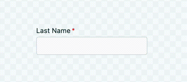
- Ensure that every text field has a clear and conspicuous label and provide clear instructions for the required format.
- The form should be enclosed within a
<form>element. - Navigability is a major challenge for visually impaired users, so make sure your form is tab-friendly and clearly label required fields.
- Include validation messages to inform the user of incorrect or missing information.
- Use helpful text or labels to provide guidance for completing form fields, specify required and optional input, and provide information about data formats and other important details.
See the WCAG website for in-depth accessibility guidance for each form element.
Credit: IBM Carbon Form Pattern Docs
- Alita Joyce, Tooltip Guidelines, (Nielsen Norman Group, 2019)
- Jakob Nielsen, OK-Cancel or Cancel-OK? The Trouble With Buttons, (Nielsen Norman Group, 2008)
- Kathryn Whitenton, Website Forms Usability: Top 10 Recommendations, (Nielsen Norman Group, 2016)
- Luke Wroblewski, Testing Accordion Forms, (A List Apart, 2010)
- Nick Babich, The Power of Defaults (UX Planet, 2017)
- Raluca Budiu, Marking Required Fields in Forms (Nielsen Norman Group, 2019)
- Andrew Coyle, Design Better Forms, (UX Collective, 2016)
- Hoa Loranger, Form Design Quick Fix: Group Form Elements Effectively Using White Space, Nielsen Norman Group, 2013)
- Marieke McCloskey, Accordions Are Not Always the Answer for Complex Content on Desktops, (Nielsen Norman Group, 2014)
- Jakob Nielsen, The Power of Defaults (Nielsen Norman Group, 2015)
- Preibusch et al., The privacy economics of voluntary over-disclosure in Web forms (2013)