
On this page
Before you continue.
In Vitality, Modals are different to Dialogs. A Dialog is a stylised container with a preset header, content and actions. A Dialog is commonly used as the content of a Modal.A Modal is a tool to cover the existing viewport, blocking the user's flow and emphasising content in the center of the screen. Any React component or JSX can be used as the content of a Modal. Please check out the Modal documentation page for how to implement it.import { Dialog } from "@vitality-ds/components";
Dialogs represent a “conversation” between the system and the user - often presenting a short-term task the user needs to perform. This can include critical or warning information where a response is required, however Dialogs are also intended to support efficient task completion without losing the context of the current workflow.
Dialogs can come in all shapes and sizes - and Vitality provides a set of variants to support the most common use cases. If your dialog's content requires functionality that goes beyond what's supported by the Dialog component, consider making a custom element that gets passed to the Modal component.
When used inside a standard <Modal />, users won't be able to interact with the page until the dialog is closed.
<Dialog
  headerProps={{
    title: "Dialog Title",
    subtitle: "Dialog Subtitle",
    icon: Info,
    closeButtonOnClick: () => alert("You closed the Dialog"),
  }}
  content="This dialog has some sample content which is simply some text displayed within the dialog. This section will form the bulk of the dialogs space is it helps direct the user in what action they should perform next, and hopefully also explain why the dialog has broken their workflow in the first place."
  actionsProps={{
    primaryButtonProps: {
      label: "Accept",
      onClick: () => alert("You clicked accept"),
    },
    cancelButtonProps: {
      label: "Cancel",
      onClick: () => alert("You cancelled"),
    },
  }}
/>
Commonly, dialogs are presented in a Modal format (ie. they pop up in a new layer and block the information behind it), but not always. Vitality provides a <ModalDialog /> component that provides both the Modal and Dialog components combined.
import { ModalDialog } from "@vitality-ds/components";
() => {
  const [modalOpen, setModalOpen] = React.useState(false);

  function escapeModal() {
    setModalOpen(false);
  }

  return (
    <Stack>
      <Button appearance="primary" onClick={() => setModalOpen(true)}>
        Open Modal
      </Button>
      <ModalDialog
        modalProps={{
          open: modalOpen,
        }}
        dialogProps={{
          headerProps: {
            title: "Dialog Title",
            subtitle: "Dialog Subtitle",
            icon: Info,
          },
          content:
            "This dialog has some sample content which is simply some text displayed within the dialog. This section will form the bulk of the dialogs space is it helps direct the user in what action they should perform next, and hopefully also explain why the dialog has broken their workflow in the first place.",
          actionsProps: {
            primaryButtonProps: {
              label: "Accept",
              onClick: () => alert("You clicked accept"),
            },
            cancelButtonProps: {
              label: "Cancel",
              onClick: escapeModal,
            },
          },
        }}
      />
    </Stack>
  );
};
-
The user is required to immediately respond - Dialogs can be used to request that the user takes immediate action or provides information that the system needs to continue a process.
-
The user needs to be notified of urgent information - Alert the user of crucial information related to their current task. Dialog boxes are commonly employed to report system errors or convey the consequences of a user's actions.
-
The system needs confirmation of user decision - The dialog should provide a clear description of the action being confirmed and explain any potential consequences that may result in cases where the action is irreversible or destructive, a transactional danger modal should be used.
-
The content is unrelated to the current workflow
-
Complex or large amounts of data need to be displayed. Instead, consider utilising a full page.
-
The result of a dialog action will navigate the user away from the current page.
-
Use dialogs sparingly - they are invasive and can hinder the user from accessing other content.
-
Focus the user - simplify dialog content by removing unnecessary interactions, elements or content that does not support the task.
-
Avoid placing multiple steps that would require navigation within the dialog. This can create complex navigational states that work counter to the notion of focusing the user on a single task.
-
Avoid complex decision making that requires additional sources of information unavailable in the modal.
-
Avoid components that will direct the user away from the dialog or using links that will take the user away from the current context and the task at hand.
Dialog is made up of three main sections: Header, Content, Actions.
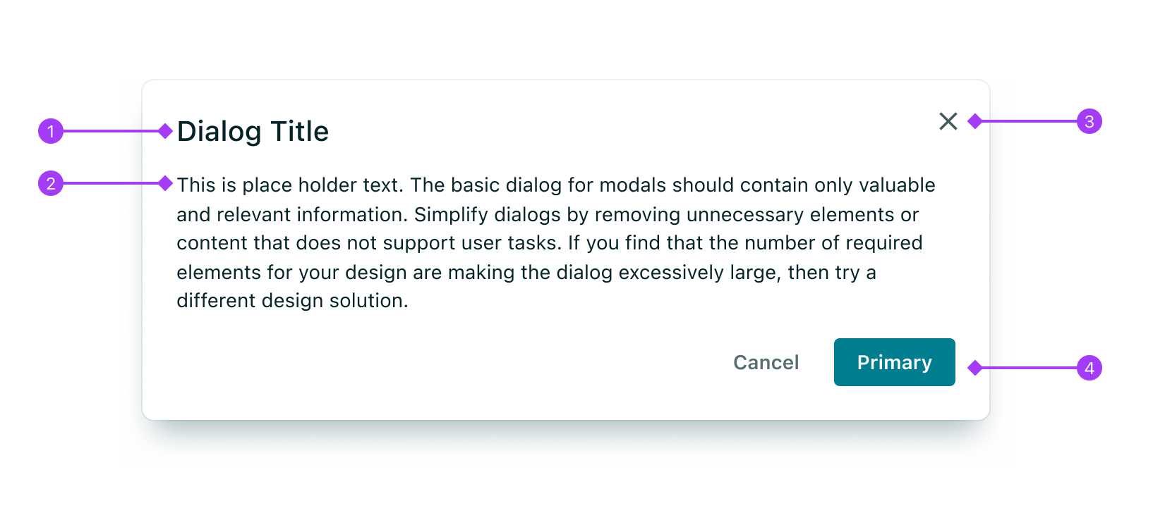
- Header: Contains the dialog's title, along with an (optional) icon.
- Content: Provides an overview of the dialog's purpose and, optionally, the controls to complete a task.
- Close Button: Optional “X” button that usually performs the same action as cancel.
- Actions: Contains a primary action and the ability to cancel and close the dialog.
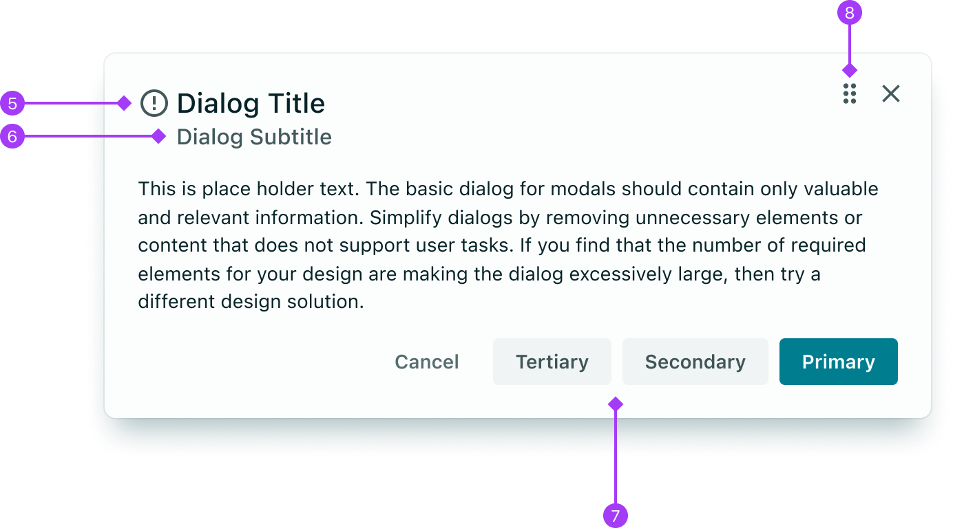
For extended use cases, the Dialog provides more options
-
Title Icon: Used sparingly to provide additional visual guidance around the meaning of the dialog. Common examples include warning and critical dialogs which present Error / Warning icons.
-
Subtitle: Option to provide additional context (see below content section for more detail)
-
Secondary Actions: Often used for transactional dialogs, allowing the user to choose from a number of actions.
The header contains the dialog's title, along with an (optional) icon. The header is customisable via the headerProps it takes an object of specific value.
The title prop is mandatory for the headerProps of all dialogs. Titles should be brief and clearly describe the dialogs’s task or purpose. They should use title case and avoid having more than a 3-4 words. If more information is necessary, provide richer context in the subtitle (see below).
Utilise common verbs that represent the dialog’s purpose and keywords that represent the entities or objects in your application. For example, [verb][entity]: “Edit Patient Details” or [verb][action] “Please Confirm Deletion”, which provides clear guidance around what the user is being requested to do.
<Dialog headerProps={{ title: "Please Confirm" }} content="[Content here]" />
The subtitle prop is optional and displays a subheading beneath the title. If not provided, the space allocated for the subtitle will be removed. The prop accepts a string value. Use the subtitle to set the context for the information in the dialog. Use sentence case.
<Dialog
  headerProps={{
    title: "Edit Contact Information",
    subtitle: "Practitioners",
  }}
  content="Content here"
/>
Icons can provide additional visual guidance around the meaning of the dialog – although they should be used sparingly. Common examples include warning and critical dialogs which present Error / Warning icons. The icon prop takes a functional component. Here you can import and call any of the Vitality icons.
<Dialog
  headerProps={{ title: "Title here", icon: Info }}
  content="Content here"
/>
Where appropriate, the close button (represented by an “X” icon) will dismiss the dialog. Read more about dismissing a dialog.
The closeButtonOnClick prop is a function that determines whether to render a close button in the dialog. If provided, the close button will be rendered; otherwise, it will not appear. The function can optionally take an event parameter that can be accessed if needed. This function should be connected to the function that closes the modal, if the dialog is being used in a modal.
<Dialog
  headerProps={{
    title: "Title here",
    closeButtonOnClick: (event) => console.log(event),
  }}
  content="Content here"
/>
A Dialog's content provides an overview of the dialog's purpose and, optionally, the controls to complete a task.
Dialog body content should contain only valuable and relevant information that is both helpful and concise. The content prop takes either a ReactNode or a string. If provided a string it will render within a Vitality Typography component. This allows you to pass whatever content you want into the dialogs.
Example with Tables:
() => {
  const columns = [
    { colId: "patientName", label: "Patient Name" },
    { colId: "age", label: "Age" },
    { colId: "dob", label: "Date of Birth" },
  ];

  const rows = [
    {
      patientName: "Owens, Vera",
      age: "32",
      dob: "21/10/1989",
    },
    {
      patientName: "Hooper, Diedre",
      age: "42",
    },
  ];

  return (
    <Dialog
      headerProps={{ title: "Patient List" }}
      content={<Table columns={columns} tableData={rows} />}
    />
  );
};
The actions section of a Dialog consists of a series of buttons designed to execute user actions based on the prompts given in the header and content. It is advisable to provide at least one primary action – however in the case of passive variants, the dialog does not require any actions.
All buttons are right-aligned, with the primary action always appearing on the far-right.
To configure the actions row, utilize the actionsProps prop, which takes an object containing primaryButtonProps, secondaryButtonProps, tertiaryButtonProps, and cancelButtonProps attributes. Each of these properties provides access to the label, onClick, isLoading, iconRight, and iconLeft properties, similar to any Vitality Button. Note that the variant of the dialog controls the appearance of the actions row.
In most cases, dialogs should present the singular action as a primary button. This main action should reflect the dialog title. The styling of this button will change based on the dialog’s variant.
For example:
- The title "Prescribe New Medication" has a button labeled "Prescribe Medication”.
- The title "Create a To Do" has a button labelled "Create".
- In cases where a user is editing a record (eg. “Edit Patient Details”, the button’s action should reflect what will happen upon committing the changes – commonly “Save”, rather than “Edit”.
- When deciding how to relate a dialog’s title to its action buttons, you can follow the above guidelines but also sense-check this with your use case. The key is to link the prompt (title) and the action (button).
<Dialog
  headerProps={{ title: "Prescribe New Medication" }}
  contentProps="[Content here]"
  actionsProps={{
    primaryButtonProps: {
      label: "Prescribe",
      onClick: () => alert("You clicked Prescribe"),
    },
  }}
/>
In addition to a primary action, it is common to also present a “Cancel” action. This cancel button has a ghost appearance. The Cancel button can be renamed to discard where the user has been prompted to make edits to an existing record, or creating a new one – where cancelling this action will result in changes being discarded.
<Dialog
  headerProps={{ title: "Accept Terms" }}
  contentProps="[Content here]"
  actionsProps={{
    primaryButtonProps: {
      label: "Accept",
      onClick: () => alert("You clicked accept"),
    },
    cancelButtonProps: {
      label: "Cancel",
      onClick: () => alert("You cancelled"),
    },
  }}
/>
In some cases, users may need one or two additional actions that go beyond the primary action. It is important to note that these actions should only be used if a primary action already exists. Careful consideration should be given to the use of secondary and tertiary actions, as they can create clutter and should be used thoughtfully.
<Dialog
  headerProps={{ title: "Dialog Title" }}
  contentProps="[Content here]"
  actionsProps={{
    primaryButtonProps: {
      label: "Accept",
      onClick: () => alert("You clicked accept"),
    },
    secondaryButtonProps: {
      label: "Second option",
      onClick: () => alert("You clicked the secondary button"),
    },
    tertiaryButtonProps: {
      label: "Third option",
      onClick: () => alert("You clicked the tertiary button"),
    },
    cancelButtonProps: {
      label: "Cancel",
      onClick: () => alert("You cancelled"),
    },
  }}
/>
With the variant prop, users can modify their dialog to one of six vitality presets. The custom variant enables passing all the props without any constraints. If you are looking for a highly customizable dialog using Vitality, then variant="custom" is the best option for you.
The custom variant is used as a point of reference for comparing and communicating differences with all other variants. In this section, all properties passed will be the same between each variant displayed, allowing for a clear visualisation of the settings between them.
<Dialog
  variant="custom"
  headerProps={{
    title: "Dialog Title",
    subtitle: "Dialog Subtitle",
    icon: Info,
    closeButtonOnClick: () => alert("You closed the Dialog"),
  }}
  content="This dialog has some sample content which is simply some text displayed within the dialog. This section will form the bulk of the dialogs space is it helps direct the user in what action they should perform next, and hopefully also explain why the dialog has broken their workflow in the first place."
  actionsProps={{
    primaryButtonProps: {
      onClick: () => alert("You clicked accept"),
    },
    secondaryButtonProps: {
      label: "Second option",
      onClick: () => alert("You clicked the secondary button"),
    },
    cancelButtonProps: {
      label: "Cancel",
      onClick: () => alert("You cancelled"),
    },
  }}
/>
Transactional dialogs are employed by the system to prompt the user to confirm the presented information. These dialogs typically feature only a single action button, commonly labeled “confirm” or “continue” and a cancel button as an alternative option.
By default, all dialogs are the transactional variant.
User approval is registered upon clicking the primary button.
The changes from custom dialogs are as follows:
- Primary actions text is defaulted to
"Confirm" - Header close button is not allowed on transactional dialogs
<Dialog
  variant="transactional"
  headerProps={{
    title: "Dialog Title",
    subtitle: "Dialog Subtitle",
    icon: Info,
    closeButtonOnClick: () => alert("You closed the Dialog"),
  }}
  content="This dialog has some sample content which is simply some text displayed within the dialog. This section will form the bulk of the dialogs space is it helps direct the user in what action they should perform next, and hopefully also explain why the dialog has broken their workflow in the first place."
  actionsProps={{
    primaryButtonProps: {
      onClick: () => alert("You clicked accept"),
    },
    secondaryButtonProps: {
      label: "Second option",
      onClick: () => alert("You clicked the secondary button"),
    },
    cancelButtonProps: {
      label: "Cancel",
      onClick: () => alert("You cancelled"),
    },
  }}
/>
Passive dialogs are non-intrusive windows that remain visible until the user dismisses them. They are commonly used for features like "view more" options in read-only tables, which enable users to view additional information without taking any further action.
It is crucial to properly allow for the different methods of closing the modal. vitality Modals and ModalDialogs allow for this functionality.
These methods of closing the modal dialog should be utilised:
- Clicking the close "x" icon in the upper-right corner of the dialog will close it without submitting any data, returning the user to their previous context.
- Clicking outside the modal window will automatically close the passive dialog.
- Pressing the "ESC" key on the keyboard will also close the passive dialog.
The changes from custom dialogs are as follows:
- No dialog actions are allowed
<Dialog
  variant="passive"
  headerProps={{
    title: "Dialog Title",
    subtitle: "Dialog Subtitle",
    icon: Info,
    closeButtonOnClick: () => alert("You closed the Dialog"),
  }}
  content="This dialog has some sample content which is simply some text displayed within the dialog. This section will form the bulk of the dialogs space is it helps direct the user in what action they should perform next, and hopefully also explain why the dialog has broken their workflow in the first place."
  actionsProps={{
    primaryButtonProps: {
      onClick: () => alert("You clicked accept"),
    },
    secondaryButtonProps: {
      label: "Second option",
      onClick: () => alert("You clicked the secondary button"),
    },
    cancelButtonProps: {
      label: "Cancel",
      onClick: () => alert("You cancelled"),
    },
  }}
/>
Warning Dialogs appear in anticipation of a significant, but not destructive change. If the warning comes before an action, clearly communicate what will happen if they proceed, and provide an alternative or opt-out where possible.
Example: Archiving something, changing a status to something that has unintended side-effects (eg. Removing HPI-I number)
The changes from custom dialogs are as follows:
- Primary actions text is defaulted to
"Confirm" - header close button is not allowed on warning dialogs
- Icon is forced to
Alertand is thewarningcolor - Header color is
warning - primary button appearance is
warning
<Dialog
  variant="warning"
  headerProps={{
    title: "Dialog Title",
    subtitle: "Dialog Subtitle",
    icon: Info,
    closeButtonOnClick: () => alert("You closed the Dialog"),
  }}
  content="This dialog has some sample content which is simply some text displayed within the dialog. This section will form the bulk of the dialogs space is it helps direct the user in what action they should perform next, and hopefully also explain why the dialog has broken their workflow in the first place."
  actionsProps={{
    primaryButtonProps: {
      onClick: () => alert("You clicked accept"),
    },
    secondaryButtonProps: {
      label: "Second option",
      onClick: () => alert("You clicked the secondary button"),
    },
    cancelButtonProps: {
      label: "Cancel",
      onClick: () => alert("You cancelled"),
    },
  }}
/>
A destructive dialog is a specific type of transactional modal that is utilised for irreversible or destructive actions. In such dialogs, the primary button is substituted with a critical button.
These dialogs are frequently employed during crucial moments as a confirmation of actions that, if taken accidentally, would result in substantial data loss.
The changes from custom dialogs are as follows:
- Primary actions text is defaulted to
"Delete" - header close button is not allowed on warning dialogs
- Icon is forced to
Errorand is thecriticalcolor - Header color is
critical - primary button appearance is
critical
<Dialog
  variant="destructive"
  headerProps={{
    title: "Dialog Title",
    subtitle: "Dialog Subtitle",
    icon: Info,
    closeButtonOnClick: () => alert("You closed the Dialog"),
  }}
  content="This dialog has some sample content which is simply some text displayed within the dialog. This section will form the bulk of the dialogs space is it helps direct the user in what action they should perform next, and hopefully also explain why the dialog has broken their workflow in the first place."
  actionsProps={{
    primaryButtonProps: {
      onClick: () => alert("You clicked accept"),
    },
    secondaryButtonProps: {
      label: "Second option",
      onClick: () => alert("You clicked the secondary button"),
    },
    cancelButtonProps: {
      label: "Cancel",
      onClick: () => alert("You cancelled"),
    },
  }}
/>
Acknowledgment dialogs are used when the system requires the user to acknowledge the presented information. It contains only a single button, commonly “OK”.
Acknowledgment is confirmed when the user clicks the primary button.
The changes from custom dialogs are as follows:
- Primary actions text is defaulted to
"Ok" - header close button is not allowed on acknowledgement dialogs
- Icon is not allowed
- Cancel action is not allowed on acknowledgement dialogs
- Secondary actions are not allowed on acknowledgement dialogs
<Dialog
  variant="acknowledgement"
  headerProps={{
    title: "Dialog Title",
    subtitle: "Dialog Subtitle",
    icon: Info,
    closeButtonOnClick: () => alert("You closed the Dialog"),
  }}
  content="This dialog has some sample content which is simply some text displayed within the dialog. This section will form the bulk of the dialogs space is it helps direct the user in what action they should perform next, and hopefully also explain why the dialog has broken their workflow in the first place."
  actionsProps={{
    primaryButtonProps: {
      onClick: () => alert("You clicked accept"),
    },
    secondaryButtonProps: {
      label: "Second option",
      onClick: () => alert("You clicked the secondary button"),
    },
    cancelButtonProps: {
      label: "Cancel",
      onClick: () => alert("You cancelled"),
    },
  }}
/>
Both a dialog's width and height should reflect the size of it's content. The width prop allows you to configure this to some degree. width configures the maximum width of the dialog where the dialog will try to fill this space the best it can but if the container reduces in size it will until the container reaches 320px. Note that on mobile or smaller screen sizes, the width prop is not enabled, and the dialog fills the full width of the screen.
width="sm"- maximum of400pxwidth="md"- maximum of600pxwidth="lg"- maximum of1000px
Custom widths are not supported by Vitality – the recommendation is to keep a consistent set of Dialog widths to reduce uncertainty for the user. If you do need a custom width, you can pass your own component to display inside a
Modalcomponent.
() => {
  const [modalSmOpen, setModalSmOpen] = React.useState(false);
  const [modalMdOpen, setModalMdOpen] = React.useState(false);
  const [modalLgOpen, setModalLgOpen] = React.useState(false);

  function escapeModal() {
    setModalSmOpen(false);
    setModalMdOpen(false);
    setModalLgOpen(false);
  }

  return (
    <Stack>
      <Button appearance="primary" onClick={() => setModalSmOpen(true)}>
        Open Small Modal
      </Button>
      <ModalDialog
        modalProps={{
          open: modalSmOpen,
          onEscapeKeyDown: escapeModal,
          onPointerDownOutside: escapeModal,
          onInteractOutside: escapeModal,
        }}
        dialogProps={{
          width: "sm",
          headerProps: {
            title: "Small dialog width",
            closeButtonOnClick: escapeModal,
          },
          content:
            "This dialog has some sample content which is simply some text displayed within the dialog. This section will form the bulk of the dialogs space is it helps direct the user in what action they should perform next, and hopefully also explain why the dialog has broken their workflow in the first place.",
        }}
      />
      <Button appearance="primary" onClick={() => setModalMdOpen(true)}>
        Open Medium (default) Modal
      </Button>
      <ModalDialog
        modalProps={{
          open: modalMdOpen,
          onEscapeKeyDown: escapeModal,
          onPointerDownOutside: escapeModal,
          onInteractOutside: escapeModal,
        }}
        dialogProps={{
          width: "md",
          headerProps: {
            title: "Medium dialog width",
            subtitle: "This is the default width",
            closeButtonOnClick: escapeModal,
          },
          content:
            "This dialog has some sample content which is simply some text displayed within the dialog. This section will form the bulk of the dialogs space is it helps direct the user in what action they should perform next, and hopefully also explain why the dialog has broken their workflow in the first place.",
        }}
      />
      <Button appearance="primary" onClick={() => setModalLgOpen(true)}>
        Open Large Modal
      </Button>
      <ModalDialog
        modalProps={{
          open: modalLgOpen,
          onEscapeKeyDown: escapeModal,
          onPointerDownOutside: escapeModal,
          onInteractOutside: escapeModal,
        }}
        dialogProps={{
          width: "lg",
          headerProps: {
            title: "Large dialog width",
            closeButtonOnClick: escapeModal,
          },
          content:
            "This dialog has some sample content which is simply some text displayed within the dialog. This section will form the bulk of the dialogs space is it helps direct the user in what action they should perform next, and hopefully also explain why the dialog has broken their workflow in the first place.",
        }}
      />
    </Stack>
  );
};
In most cases, the dialog’s content should be short, concise and immediately obvious to the user what action is expected. Naturally, this means a dialog does not consume a lot of space. This is not easily achieved if there's a lot of content that overflows the viewport, so avoid any content that's not critical to the workflow.
When a dialog’s content does require its bounds to stretch, its height will grow until the outer height of the Dialog fills the available viewport space (minus any padding). If the content still does not fit, the Dialog’s content area will become scrollable - with the dialog’s header and actions areas staying “sticky” to the top and bottom.
() => {
  const [modalOpen, setModalOpen] = React.useState(false);

  function escapeModal() {
    setModalOpen(false);
  }

  return (
    <Stack>
      <Button appearance="primary" onClick={() => setModalOpen(true)}>
        Open Overflowing Modal
      </Button>
      <ModalDialog
        modalProps={{
          open: modalOpen,
          onEscapeKeyDown: escapeModal,
          onPointerDownOutside: escapeModal,
          onInteractOutside: escapeModal,
        }}
        dialogProps={{
          headerProps: {
            title: "Dialog Title",
            subtitle: "Dialog Subtitle",
            icon: Info,
            closeButtonOnClick: escapeModal,
          },
          content:
            "This dialog has some sample content which is simply some text displayed within the dialog. This section will form the bulk of the dialogs space is it helps direct the user in what action they should perform next, and hopefully also explain why the dialog has broken their workflow in the first place. This dialog has some sample content which is simply some text displayed within the dialog. This section will form the bulk of the dialogs space is it helps direct the user in what action they should perform next, and hopefully also explain why the dialog has broken their workflow in the first place. This dialog has some sample content which is simply some text displayed within the dialog. This section will form the bulk of the dialogs space is it helps direct the user in what action they should perform next, and hopefully also explain why the dialog has broken their workflow in the first place. This dialog has some sample content which is simply some text displayed within the dialog. This section will form the bulk of the dialogs space is it helps direct the user in what action they should perform next, and hopefully also explain why the dialog has broken their workflow in the first place. This dialog has some sample content which is simply some text displayed within the dialog. This section will form the bulk of the dialogs space is it helps direct the user in what action they should perform next, and hopefully also explain why the dialog has broken their workflow in the first place. This dialog has some sample content which is simply some text displayed within the dialog. This section will form the bulk of the dialogs space is it helps direct the user in what action they should perform next, and hopefully also explain why the dialog has broken their workflow in the first place. This dialog has some sample content which is simply some text displayed within the dialog. This section will form the bulk of the dialogs space is it helps direct the user in what action they should perform next, and hopefully also explain why the dialog has broken their workflow in the first place. This dialog has some sample content which is simply some text displayed within the dialog. This section will form the bulk of the dialogs space is it helps direct the user in what action they should perform next, and hopefully also explain why the dialog has broken their workflow in the first place. This dialog has some sample content which is simply some text displayed within the dialog. This section will form the bulk of the dialogs space is it helps direct the user in what action they should perform next, and hopefully also explain why the dialog has broken their workflow in the first place. This dialog has some sample content which is simply some text displayed within the dialog. This section will form the bulk of the dialogs space is it helps direct the user in what action they should perform next, and hopefully also explain why the dialog has broken their workflow in the first place. This dialog has some sample content which is simply some text displayed within the dialog. This section will form the bulk of the dialogs space is it helps direct the user in what action they should perform next, and hopefully also explain why the dialog has broken their workflow in the first place. This dialog has some sample content which is simply some text displayed within the dialog. This section will form the bulk of the dialogs space is it helps direct the user in what action they should perform next, and hopefully also explain why the dialog has broken their workflow in the first place. This dialog has some sample content which is simply some text displayed within the dialog. This section will form the bulk of the dialogs space is it helps direct the user in what action they should perform next, and hopefully also explain why the dialog has broken their workflow in the first place. This dialog has some sample content which is simply some text displayed within the dialog. This section will form the bulk of the dialogs space is it helps direct the user in what action they should perform next, and hopefully also explain why the dialog has broken their workflow in the first place.",
          actionsProps: {
            primaryButtonProps: {
              label: "Accept",
              onClick: () => alert("You clicked accept"),
            },
            cancelButtonProps: {
              label: "Cancel",
              onClick: escapeModal,
            },
          },
        }}
      />
    </Stack>
  );
};
- On screens below
@bp1, modal dialogs will align to the bottom of the screen. Read more about responsive styles. - The maximum height is
100vhminus a 16px top margin to ensure the “modal” nature of the dialog is always obvious. - The same scrolling behaviour occurs if content overflows.
- To see this behaviour in action, reduce the width of your browser window and open any of the ModalDialogs on this page.
This functionality is provided via the Modal component, which is what provides a dialog's show/hide behaviour. Read more on the Modal docs.
Focus is automatically set on the first interactive element inside the dialog when opened, and onto the document body when closed. This can be customised through the onOpenAutoFocus and onCloseAutoFocus callback functions that can be passed to modalProps.
See the focus management section of the Modal documentation for a full guide on best practises. Native HTML input and button elements also allow you to pass autoFocus as an attribute, which will apply focus to that element once rendered. This will allow you to set focus without needing to define a ref. If multiple HTML elements have this attribute, the first one to appear in the DOM will have focus. Note that if you passautoFocus: trueto any of the elements within the dialog, this will take precedence overonOpenAutoFocus so be mindful of the hierarchy.
You can set focus using
autoFocusoronOpenAutoFocusand if both are passed,autoFocuswill take priority
() => {
  const [firstModalOpen, setFirstModalOpen] = React.useState(false);
  const [secondModalOpen, setSecondModalOpen] = React.useState(false);

  function escapeModal() {
    setFirstModalOpen(false);
    setSecondModalOpen(false);
  }

  const lastNameRef = React.useRef();
  const dialogTriggerRef = React.useRef();

  const onOpenAutoFocus = (event) => {
    event.preventDefault();
    lastNameRef.current.focus();
  };

  const onCloseAutoFocus = (event) => {
    event.preventDefault();
    dialogTriggerRef.current.focus();
  };

  const modalProps = {
    onEscapeKeyDown: escapeModal,
    onPointerDownOutside: escapeModal,
    onInteractOutside: escapeModal,
  };

  const dialogProps = {
    headerProps: {
      title: "Dialog Title",
      subtitle: "Dialog Subtitle",
      icon: Info,
      closeButtonOnClick: escapeModal,
    },
    actionsProps: {
      primaryButtonProps: {
        label: "Accept",
        onClick: () => alert("You clicked accept"),
      },
      cancelButtonProps: {
        label: "Cancel",
        onClick: escapeModal,
      },
    },
  };

  return (
    <Stack align="stretch">
      <Button
        ref={dialogTriggerRef}
        appearance="primary"
        onClick={() => setFirstModalOpen(true)}
      >
        Open Modal with onOpenAutoFocus
      </Button>
      <Button appearance="primary" onClick={() => setSecondModalOpen(true)}>
        Open Modal with autoFocus
      </Button>
      <ModalDialog
        modalProps={{
          ...modalProps,
          open: firstModalOpen,
          onOpenAutoFocus: onOpenAutoFocus,
          onCloseAutoFocus: onCloseAutoFocus,
        }}
        dialogProps={{
          ...dialogProps,
          content: (
            <div style={{ padding: "8px" }}>
              <FormField type="text" label="First Name" />
              <FormField
                type="text"
                label="Last Name"
                inputProps={{ ref: lastNameRef }}
              />
            </div>
          ),
        }}
      />
      <ModalDialog
        modalProps={{
          ...modalProps,
          open: secondModalOpen,
        }}
        dialogProps={{
          ...dialogProps,
          content: (
            <div style={{ padding: "8px" }}>
              <FormField type="text" label="First Name" />
              <FormField
                type="text"
                label="Last Name"
                inputProps={{ autoFocus: true }}
              />
            </div>
          ),
        }}
      />
    </Stack>
  );
};
The action of completing a task should take place immediately and ideally the user should not have to wait for a response. There are however some cases where data needs to be processed before a response can be provided.
Dialogs have two patterns for indicating this waiting period:
- If the waiting period is quick, disable any form elements and use the inline loading behaviour on the primary button to indicate the data is being processed.
- If a longer waiting period is needed then a loading spinner and overlay should appear on top of the modal body area with content disabled. The primary action button should be disabled while loading is in progress.
() => {
  const [modalOpen, setModalOpen] = React.useState(false);
  const [isLoading, setIsLoading] = React.useState(false);

  function escapeModal() {
    setModalOpen(false);
  }

  const firstNameRef = React.useRef(null);

  return (
    <Stack>
      <Button appearance="primary" onClick={() => setModalOpen(true)}>
        Open Modal
      </Button>
      <ModalDialog
        modalProps={{
          open: modalOpen,
          onEscapeKeyDown: escapeModal,
          onPointerDownOutside: escapeModal,
          onInteractOutside: escapeModal,
          onOpenAutoFocus: (e) => {
            firstNameRef.current.focus();
          },
        }}
        dialogProps={{
          headerProps: {
            title: "Dialog Title",
            subtitle: "Dialog Subtitle",
            icon: Info,
            closeButtonOnClick: escapeModal,
          },
          content: (
            <>
              <FormField
                type="text"
                label="First Name"
                inputProps={{
                  ref: firstNameRef,
                  value: "Roberta",
                  disabled: isLoading,
                }}
              />
            </>
          ),
          actionsProps: {
            primaryButtonProps: {
              label: "Accept",
              isLoading: isLoading,
              onClick: () => setIsLoading(true),
            },
            cancelButtonProps: {
              label: "Cancel",
              onClick: escapeModal,
            },
          },
        }}
      />
    </Stack>
  );
};
There are three main keyboard interactions with a dialog:
- Escape key - in some cases will trigger a dismissal of the dialog, handled via the modal
- Enter/Return key - should trigger the action on the first main interactive element (which should be focused by default)
- Tab key - manages focus on any interactive elements within the dialog. Common elements include the dialog’s content (if interactive), action buttons and “X” button
actionsProps
Description
Controls the props associated with the actions: primaryButtonProps`, `secondaryButtonProps`, `tertiaryButtonProps`, and `cancelButtonProps
Type
ActionsPropsType
contentRequired
Description
renders either the ReactNode passed or renders the string inside a vitality Typography component.
Type
Element
headerPropsRequired
Description
Controls the props associated with the header: title`, `subtitle`, `closeButtonOnClick`, and `icon
Type
HeaderPropsType
variant
Type
"custom" | "transactional" | "passive" | "warning" | "destructive" | "acknowledgement"
Default Value
transactional
width
Description
Controls the maximum width the dialog content can fill.
Type
"sm" | "md" | "lg"
Default Value
md
dialogPropsRequired
Description
All the props associated with dialog for the purpose of the ModalDialog
Type
DialogProps
modalPropsRequired
Description
All the props associated with modals for the purpose of the ModalDialog
Type
ModalProps